
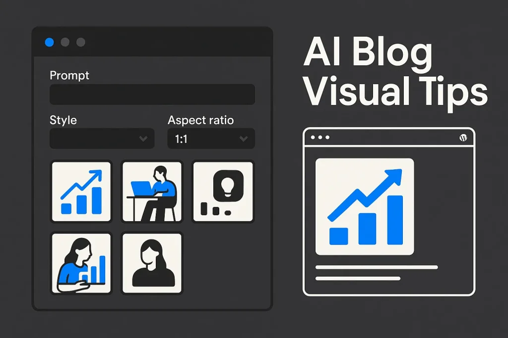
Blog visuals now sit inside the same production system as keyword research, outlines, publishing, and on-page SEO. That changes how an ai image generator from text should be used. The goal is not novelty. It is repeatable, clean, context-matched visuals that load well, fit the article layout, support click-through, and do not create extra editing work.
For bloggers and content teams, the gap between usable and unusable output usually comes down to a handful of controllable choices: subject, action, style, framing, ratio, cleanup constraints, and export discipline. The strongest workflows do not depend on long poetic prompts. They depend on precise instructions, a stable visual system, and a review loop that treats images as production assets, not experiments.
We see this all the time: modern text to image ai for blogs works best as an editorial process, not a toy. A featured image is not an isolated design file. It is part of a page template, part of a brand system, and often part of a publishing cadence that has to scale.
Who this guide is for
This guide is for bloggers, content marketers, SEO managers, agencies, startup teams, and WordPress site owners who need featured images or supporting blog illustrations without turning every post into a design project.
It is especially useful in four common scenarios:
- Solo bloggers who publish consistently and need a fast, low-friction way to generate clean illustrations.
- SEO teams that produce many articles and need image consistency across clusters, categories, or clients.
- Agencies that want faster visual production without handing every brief to a designer.
- Founders and in-house marketers who need article visuals that look professional enough for a business site, not like generic AI outputs.
If the goal is highly detailed product photography, campaign art direction, or dense branded typography inside the image, a pure text to image generation workflow may still need manual design support. For most editorial blog use cases, though, a controlled ai text to image workflow is enough.
На наш погляд, це важливе розмежування. Бізнес-блогу рідко потрібен «вау-арт»; йому потрібен передбачуваний результат без зайвих ітерацій.
What “professional” AI blog visuals require
Professional here does not mean visually complex. It means useful in production. A strong blog image has five operational qualities.
First, it is relevant to the article topic. A post about technical SEO should not use a random futuristic robot. A post about internal linking should show relationships, structure, nodes, documents, or editorial systems.
Second, it is visually clean. The frame should not contain extra objects, cluttered backgrounds, unreadable fake UI, accidental text fragments, or distorted elements.
Third, it is brand-compatible. The palette, illustration style, and composition should feel coherent across multiple posts.
Fourth, it is layout-aware. WordPress themes handle featured images differently. According to WordPress featured image guidance, there is no single universal size that fits every theme perfectly. So ratio planning belongs in the prompt, not at the end.
Fifth, it is export-ready. The image should be sharp enough for the slot where it appears, but not so heavy that it slows the page or creates layout issues.
That is exactly why a generic ai pictures generator from text output so often fails on business blogs: the model may produce something eye-catching, but editorially it is useless.
We would put it even more plainly. If the image cannot survive upload, crop, and brand review, it is not professional no matter how impressive the preview looked.
How text-to-image generators work (quick overview)
A modern ai text to image generator interprets written instructions as constraints. The model predicts a visual output based on your description of what should appear, how it should look, and what should be avoided. In practice, it performs best when the prompt gives it a limited, clear problem to solve.
For bloggers, the implication is simple: better prompts are usually more specific, not necessarily longer. In OpenAI’s current image guidance, a good prompt does not need to be long, and the most useful structure centers on the goal, subject, action, setting, and style, as described in the OpenAI prompt guide.
That is good news for editorial teams. You do not need paragraph-length prompt writing. You need a repeatable schema.

There is also an infrastructure shift worth noting. According to the OpenAI Images API, current image generation supports square 1024×1024, landscape 1536×1024, portrait 1024×1536, and auto sizing in modern GPT image workflows. The same documentation states that DALL·E 2 and DALL·E 3 are deprecated in the Image API, with support ending on May 12, 2026. For evergreen tutorials, the useful framing is no longer “which old branded model name should I mention,” but “how do I structure prompts and ratios in a current workflow.”
For practical blog publishing, think of a text to image generator as a constrained visual assistant. Fast, helpful, and imperfect. It can propose compositions quickly, but it still depends on the quality of the instructions and the discipline of the review process.
Ми помітили, що саме тут багато команд помиляються: вони сперечаються про інструмент, хоча реальна перевага з’являється від системи роботи з ним. Це не дрібниця, а різниця між хаосом і масштабованим продакшеном.
A reusable prompt framework for bloggers
The most practical framework for a blog illustration prompt has five parts:
- Goal: what the image is for. Example: featured image for a blog post about technical SEO audits.
- Subject: the main object or scene. Example: a clean dashboard with audit metrics and page structure elements.
- Action: what is happening. Example: visual indicators of analysis, optimization, or publishing flow.
- Style: the look and level of realism. Example: minimalist flat illustration, isometric SaaS scene, or polished 3D interface render.
- Control constraints: ratio, background simplicity, palette, no text artifacts, no extra objects, no people if irrelevant.
A reusable base prompt often looks like this:
Base prompt: “Create a clean featured illustration for a blog post about [topic]. Show [subject] with [action]. Use [style]. Composition: [ratio/orientation], centered focal point, generous negative space. Palette: [colors]. Background: [simple background type]. Avoid extra objects, messy details, unreadable text, watermarks, and distorted elements.”
This framework works whether you use an ai image prompt generator, a native prompt box, or a broader content workflow. It also adapts well to category templates where you want consistency across dozens of posts.
| Prompt part | What to specify | Why it matters |
|---|---|---|
| Goal | Featured image, in-article illustration, category banner | Aligns composition and detail level with page placement |
| Subject | Dashboard, document stack, content pipeline, keyword map | Prevents generic or irrelevant visual metaphors |
| Action | Analyzing, publishing, connecting pages, generating images | Creates visual intent instead of static object lists |
| Style | Flat illustration, isometric SaaS, industrial 3D | Keeps outputs consistent across the blog |
| Constraints | Aspect ratio, palette, no clutter, no text artifacts | Reduces regeneration and cleanup time |
A short prompt with strong structure usually beats a long prompt stuffed with decorative adjectives.
На практиці це і є робочий компроміс між швидкістю та якістю. Не «магічний prompt», а стабільний каркас.
Tip 1 — Define a consistent illustration style
Style consistency is the fastest way to make AI-generated blog visuals look professional. A site that mixes photorealistic images, cartoon icons, soft watercolor scenes, and neon sci-fi renders will look improvised even if each individual image is acceptable.
For blogs in SEO, SaaS, B2B, analytics, and technology, three styles tend to work well:
Minimal flat illustration. Good for clear concepts, fast load-friendly exports, and broad category consistency.
Isometric SaaS scenes. Useful when the article covers dashboards, workflows, automation, publishing systems, analytics, or software operations.
Strict industrial 3D. Good when you want a premium, productized feel without using literal stock photography.
If you are using a best text to image ai workflow for editorial production, create one style definition and reuse it. Example: “minimalist flat illustration, clean geometric shapes, muted graphite background, blue accent, editorial SaaS aesthetic, no people, no decorative clutter.”
Adobe’s April 2025 Firefly update highlighted Structure and Style Reference controls, as described in Adobe’s 2025 Firefly update. That matters beyond Adobe itself: it signals that reproducibility and brand consistency are now mainstream workflow features, not fringe prompt tricks.
Our position is simple: style drift is one of the easiest ways to make a serious blog look amateur. Pick one visual language and defend it.
Tip 2 — Describe the subject and action clearly
Many weak outputs fail because the prompt names a topic but not a visual scene. “SEO content marketing illustration” is too vague. The model has too much room to invent. Better prompts specify what the viewer should actually see.
Compare the difference:
Weak: “Create an SEO illustration.”
Strong: “Create a featured illustration for a blog post about internal linking. Show a website structure map with connected pages, link paths, and a clean analytics dashboard beside it. Minimal flat design, dark neutral background, blue accent, simple composition.”
The second version defines both subject and action. The site architecture is the subject. The connection and analysis are the action.
When using a text to picture ai workflow, name one dominant subject and one supporting subject at most. Too many objects create clutter. For business blogs, three focused elements are usually enough: interface, document, graph; or page, link node, analytics panel.

We consider this one of the most underrated prompt fixes. Specificity is not about writing more words; it is about removing ambiguity before the model fills the gap with nonsense.
Tip 3 — Control composition and aspect ratio
Composition is where many blog visuals break. The image may look good in a generator preview but fail once it is cropped into a theme slot, social card, or archive thumbnail.
Aspect ratio should be planned before generation. The current OpenAI Images API supports square 1024×1024, landscape 1536×1024, portrait 1024×1536, and auto sizing in GPT image workflows, according to the OpenAI Images API documentation. For blog featured images, landscape formats are often safer because many themes present horizontal previews.
Practical composition rules:
- Keep the focal subject away from the edges.
- Leave negative space for possible crop variations.
- Avoid tiny details in the outer margins.
- Prefer centered or slightly off-center compositions over crowded edge-to-edge scenes.
- If text might be overlaid later, reserve a clean area intentionally.
The table below shows how prompt planning changes with the image slot.
| Use case | Preferred ratio logic | Prompt note |
|---|---|---|
| WordPress featured image | Usually landscape | Ask for wide composition and safe margins |
| Social preview crop | Horizontal with strong center | Keep the key object near the center third |
| Inline article illustration | Square or landscape | Use simpler scenes with fewer fine details |
| Sidebar or card thumbnail | May crop tightly | Avoid text and edge-dependent elements |
Theme behavior matters more than theory. Test on your actual template.
For blogs, landscape generation is often the most practical starting point because it survives more front-end display contexts.
Ми вважаємо, що саме crop safety відсікає більшість «красивих, але марних» варіантів. Якщо зображення розвалюється в картці категорії, воно вже програло.
Tip 4 — Palette, background, and brand colors
A good image can still look wrong if its palette conflicts with the site. Brand compatibility should be prompted directly. If your site uses dark neutrals and blue accents, say so. If your articles use white backgrounds and subtle gray cards, say that too.
Prompting for palette does three jobs at once. It improves visual consistency, reduces random color noise, and makes future batches easier to review. A prompt like “graphite, white, and muted blue palette, restrained contrast, clean neutral background” is usually enough.
Background control is equally important. A common reason free ai image generator from text outputs look amateur is that they overfill the frame with glowing details, random shapes, or cinematic gradients that distract from the article’s topic. For editorial visuals, simple is usually better.
Good background constraints include:
simple neutral background, minimal abstract shapes, soft gradient only, no busy texture, no extra floating objects.
If your brand uses one primary accent, mention it exactly once. Repeating color demands too aggressively can make the output unnatural.
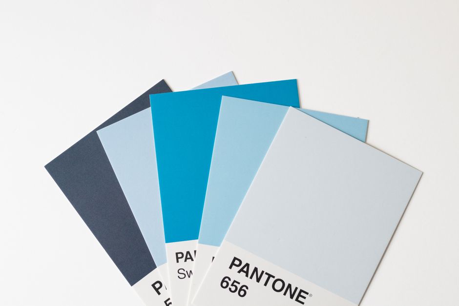
Interesting thing here: many teams blame the model when the real issue is color discipline. On our side, palette control is one of the cheapest quality upgrades you can make.
Tip 5 — Lighting and camera cues for clarity
Lighting and camera language can dramatically improve clean output, especially in 3D or semi-realistic styles. Bloggers often ignore this because it sounds like photographer vocabulary, but in practice it is highly functional.
For example, “soft studio lighting” often produces more readable forms than “dramatic cinematic lighting.” “Straight-on angle” or “slight isometric view” gives the model a clearer spatial instruction than leaving perspective open. “Sharp focus on the main subject” helps reduce visual drift.
Useful cues include:
soft studio lighting, even lighting, clean shadows, straight-on composition, slight isometric perspective, sharp subject separation.
What to avoid for most business blogs: harsh lens flare, extreme depth-of-field blur, dramatic backlight, heavy film grain, and cinematic haze. Those can look impressive in isolation but reduce clarity in thumbnails and archive grids.
In a text to image ai tools workflow, these cues matter most when the style leans toward interface realism or polished 3D. In flat illustration styles, composition and object simplification matter more than lighting nuance.
Our take: clarity beats drama almost every time in editorial contexts. Especially when the image has to work at 300 pixels wide.
Tip 6 — Quality tokens, upscaling, and denoising strength
Some platforms expose more generation controls than others. You may see options related to quality, steps, stylization, upscaling, denoising, or detail preservation. The right choice depends on where the image will be used.
For featured images, quality should serve clarity, not complexity. Overprocessing often introduces artificial texture, oversharpening, or decorative noise. If your platform offers an upscale pass, use it selectively and check whether it actually improves edges or simply makes flaws larger.
As a rule:
Use standard generation first. If composition and subject are correct, refine after that.
Upscale only after selection. Do not upscale every candidate in a batch.
Avoid excessive denoising changes. Very strong denoising or aggressive restyling can erase the clean structure you wanted.
For an ai image editor workflow, small iterative corrections usually outperform full regeneration when the original image is already close. Typical fix cases include simplifying a background, removing a stray object, or tightening the crop.
We have seen this repeatedly in production: the last 10% of polish can easily destroy the first 90% of usefulness. More controls do not automatically mean better output.
Tip 7 — Negative prompts to remove artifacts
Negative prompting is one of the simplest ways to reduce unusable output. The principle is straightforward: say what should not appear.
For blog visuals, good negative prompt terms are usually practical rather than dramatic. You are not fighting surrealism. You are preventing clutter and errors.
Common negative constraints:
- no extra objects
- no distorted hands or faces
- no unreadable text
- no watermark
- no logo
- no messy background
- no duplicate elements
- no cropped subject
- no random UI gibberish
- no over-detailed scene
OpenAI’s image generation guidance explicitly notes that when layouts include words inside the picture, text should be kept short, and for denser layouts it helps to emphasize sharp text rendering in the prompt, according to the OpenAI image generation guide. For blog covers, the practical takeaway is stricter: avoid embedding lots of text inside the generated image in the first place. If a label is necessary, keep it minimal or add it later in design.
The point is prioritization, not measurement: control the variables that remove failure first.
На наш погляд, negative prompts — це не «просунутий хак», а базова гігієна. Без них ви просто витрачаєте більше часу на перебір сміттєвих варіантів.
Tip 8 — Reproducibility: seed and reference images
If your workflow supports seed values or reference images, use them as operational tools. Reproducibility matters when one article performs well and you want future visuals in the same family.
A stable seed can help preserve general composition logic across variations. A style reference can help maintain the same illustration language. A structure reference can help keep layout rhythm consistent.
Do not overload the model with many references. OpenAI’s guidance notes that multiple input images can help guide generation or editing, but a small set is easier to manage than a large batch, as described in the OpenAI prompting guidance. In production, that usually means one clean style reference and one content reference are enough.
This is also where a ai image generator from image workflow can be useful. Instead of prompting from zero every time, you can build a style system from your best prior outputs and create controlled variations.
For teams, save more than the final image. Save the prompt, negative prompt, ratio, seed if available, export settings, and where the image was used. That turns one good result into a reusable asset pattern.

We strongly recommend treating this as documentation, not just inspiration. Once a team starts saving prompt logic systematically, visual production becomes much easier to scale.
Tip 9 — Batch, score, and A/B test featured images
Do not judge an image workflow by a single output. Generate small batches, compare them against the same criteria, and keep a record of what wins.
A simple review scorecard works well:
Topical relevance, thumbnail clarity, brand consistency, artifact risk, crop safety.
Generate three to five variations per article. Reject anything that fails on relevance or clarity, even if it looks visually ambitious. Featured images work at small sizes first.
This is also where A/B logic helps. If your CMS, email system, or social distribution process lets you compare alternatives, test whether simpler images outperform more complex ones. In many B2B contexts, they do, because they communicate faster.
The scale of visual production itself is no longer niche. Adobe reported in February 2025 that Firefly had generated more than 18 billion assets globally, as noted in Adobe’s Firefly news release, and by April 24, 2025 that figure had grown to more than 22 billion, according to Adobe’s later product update. The business takeaway is not hype. It is that image generation now belongs to normal production operations, so review discipline matters more, not less.
Large-scale adoption does not eliminate the need for editorial standards. It makes them more important.
We think this is where mature teams separate themselves. They do not ask, “Can we generate images?” They ask, “Which image pattern actually performs and scales?”
Exporting for WordPress: sizes, formats, and alt text
Export is where many otherwise good visuals lose value. A strong image that is too heavy, cropped poorly, or uploaded without alt text creates avoidable SEO and UX problems.
Start with the theme. WordPress.com documentation makes it clear that featured image dimensions depend on the active theme, not on a universal standard. Test the image in single post view, archive cards, homepage blocks, and social preview contexts if relevant.
For practical export:
- Generate in a ratio that matches your common featured slot.
- Export only as large as needed for the theme and responsive rendering strategy.
- Prefer a clean format suitable for the visual type and your compression workflow.
- Check load impact before publishing batches of oversized images.
Alt text should describe the image for context, not repeat the entire headline. It can naturally include the focus term when relevant, but should stay readable. Example: “Illustration of an AI image generator from text workflow for WordPress blog visuals.”
If the image is purely decorative, your accessibility approach may differ, but featured images often support meaning and should be described accordingly.
| Export element | Best practice | Risk if ignored |
|---|---|---|
| Dimensions | Match common theme display behavior | Awkward crop or soft rendering |
| File weight | Compress after generation if needed | Slower page loads |
| Crop safety | Keep focal subject away from edges | Key visual gets cut off |
| Alt text | Describe image content clearly | Weaker accessibility and context signals |
The best image is the one that still works after upload, crop, compression, and preview.

On our side, this is one of the most common operational misses. Teams optimize the prompt and forget the file pipeline.
One‑click featured images with SEO Autopilot (vs manual prompting)
Manual prompting works, but it creates process overhead. Someone still has to interpret the article topic, decide on the scene, define the style, check ratio fit, export the file, upload it, and verify that the image actually matches the content context.
That is where a workflow product is more valuable than a standalone free text to image ai generator or even a free ai image generator from text. A full SEO autopilot workflow matters because image generation is only one part of the content operation.
SEO Autopilot approaches this more efficiently by connecting the visual step to the article itself. Its one-click featured image generation is designed to create article-matched visuals automatically, so the featured image aligns with the page context instead of being manually improvised after the text is finished. That reduces switching costs between writing, prompting, editing, and publishing.
For teams publishing at scale, this matters in three ways: faster production, more consistent output, and less dependency on manual interpretation of every topic. If you want to see the broader workflow, the guide to Bing Image Creator for blog covers is also useful as a comparison point for manual image workflows.
More importantly, the platform ties this into a larger SEO system: semantics, structure, article generation, internal linking, and WordPress publishing. You can review the product flow on the official SEO Autopilot site.
We think the real advantage here is not just speed. It is fewer handoffs, fewer subjective decisions, and less room for visual mismatch between article and image.
Prompt templates you can copy and adapt
These templates are intentionally short. They are designed for bloggers who need clean outputs, not prompt theater.
Template 1 — SaaS or SEO blog featured image
“Create a clean featured illustration for a blog post about [topic]. Show a modern dashboard interface with [specific subject] and [specific action]. Minimal flat or isometric SaaS style, dark neutral background, blue and white accents, landscape composition, centered focal point, generous negative space. No people, no watermark, no unreadable text, no extra objects, no clutter.”
Template 2 — Process or workflow article
“Create a professional editorial illustration for an article about [topic]. Show a step-by-step content workflow with [elements]. Clean geometric composition, simple background, restrained palette, landscape ratio, sharp details, business blog style. Avoid random icons, fake UI text, duplicate elements, and over-detailed scenery.”
Template 3 — Technical concept with structure
“Create a structured illustration for a blog article about [topic]. Show [main object] connected to [supporting object], with clear visual hierarchy and simple composition. Minimal flat design, neutral background, brand blue accents, clean lines, no decorative clutter, no distorted elements, no logos.”
Template 4 — If text must appear inside the image
“Create a clean featured image for [topic] with one short label only: ‘[short text]’. Keep typography large, sharp, and minimal. Use a simple composition with clear negative space. No extra text, no gibberish, no clutter.”
If you use a text to image prompt generator, these templates can serve as stable inputs that you customize by topic rather than rewriting from scratch each time.
They also work well inside many text to image generators and can be adapted for a text to image creator or an image creator from text workflow without changing the underlying logic.

На практиці шаблони дисциплінують команду краще, ніж десятки «креативних» експериментів. Це не обмеження, а спосіб тримати якість під контролем.
Troubleshooting common failure modes
Most failures repeat. Once you identify the pattern, fixes become predictable.
The image looks generic
The prompt is probably too abstract. Add a concrete subject and action. Replace “digital marketing visual” with “analytics dashboard showing traffic growth and content planning board.”
The frame is cluttered
Too many objects or too much style intensity. Reduce the number of scene elements. Add “simple composition,” “no extra objects,” and “minimal background.”
The colors feel off-brand
The palette was not constrained. Add a specific color system and remove cinematic language that invites random gradients.
The image breaks when cropped
The composition is too edge-dependent. Ask for safe margins, centered focal point, and wide composition.
There is broken text inside the image
Remove text from the generated image or keep it to one short label only. Add “sharp minimal text” only if truly necessary.
The output is too literal or too childish
Refine the style. Move from “cartoon illustration” to “editorial flat illustration” or “professional isometric SaaS scene.”
The batch is inconsistent
You are changing too many variables. Lock the style, palette, and ratio; vary only the topic-specific subject and action.
If you are working with different text to image ai tools, check whether the issue comes from prompt structure or from the underlying text to image ai model. Some failures are prompt problems. Others are model-behavior problems, and it helps to know the difference.
An ai image detector is not the core issue here. For most bloggers, the production problem is not whether an image can be flagged as AI. The real issue is whether it looks credible, supports the article, and fits the site.
We would not overcomplicate this. If the output looks fake, generic, or messy, readers do not care why. They just trust the page less.
Legal and licensing basics for commercial blogs
Commercial use rules depend on the tool and its terms, so the first step is always checking the current license for the platform you use. That includes generation rights, editing rights, indemnity language if any, and restrictions on sensitive or trademarked content.
For bloggers, three legal filters matter most:
- Tool terms: what the platform allows commercially.
- Training and provenance positioning: how the vendor describes the sources behind the model.
- Output review: whether the final image includes logos, trademark-like shapes, identifiable people, or misleading brand references.
Adobe states in its FAQ that its initial commercial Firefly model was trained on Adobe Stock images, openly licensed content, and public-domain content where copyright has expired, according to Adobe’s Firefly FAQ. That does not automatically settle every legal question for every platform, but it shows why provenance and commercial-use framing matter when evaluating tools.
The strategic point is simple: “AI-generated” is not a license category by itself. Commercial blog use depends on the vendor’s rules, your actual output, and your publishing standards.
Canva’s 2025 Visual Economy Report surveyed 1,600 business leaders across the US, UK, and Australia, according to Canva’s Visual Economy Report 2025. That reinforces a broader business reality: visual production is now a mainstream operating function, which means governance, review, and consistency should be handled like any other content workflow.
We think the legal side is often underestimated until a team starts publishing at scale. The safer approach is boring but effective: check terms, review outputs, document decisions.
Our view in short: the strongest blog visual workflows are not built on clever prompting alone. They combine a stable style system, clear prompt structure, crop-safe composition, and disciplined export rules. Businesses that treat ai image generator from text as part of a broader editorial pipeline usually get better results than teams chasing one-off “best image” moments.
The most reliable approaches are also the least glamorous. Reusable templates, small batch testing, selective editing, and reference-based consistency outperform improvisation in real publishing environments. The main risk for the next year is not low-quality generation itself; it is process debt from teams producing visuals faster than they can review, standardize, and govern.
Looking ahead, we expect more workflows to blend prompt-based generation with structured references, integrated publishing, and lightweight editing rather than relying on standalone tools. We also expect the gap to widen between casual image creation and production-ready visual systems. In other words, the winners will not be the teams with the fanciest prompts, but the ones with the cleanest operations.
FAQ
What is the best text-to-image AI for blog featured images?
The best option is the one that gives you clean output, reliable ratio control, and a workflow that fits publishing. For most bloggers, consistency and speed matter more than novelty. A strong ai image generator from text setup should support clear prompts, practical exports, and repeatable style.
How do I write a prompt for clean, professional blog illustrations?
Use five parts: goal, subject, action, style, and constraints. Keep it short and precise. A good prompt for an ai text to image generator names what should appear, how it should look, what ratio it needs, and what should be excluded.
What aspect ratio and size should I use for WordPress featured images?
Use the ratio that matches your theme’s featured image slot, usually landscape for many blogs. There is no universal WordPress size that works for every site, so test in your active theme before standardizing exports.
How can I avoid AI image artifacts like extra fingers or messy text?
Use negative prompts and simplify the scene. Ask for no extra objects, no unreadable text, no duplicate elements, and no distortions. If text inside the image is necessary, keep it very short or add it later outside the generator.
Can I use AI-generated images commercially on my blog?
Often yes, but only if the platform’s current terms allow it and your output does not introduce legal issues. Review license terms, avoid trademarks or misleading brand references, and treat each tool’s commercial-use policy separately.