
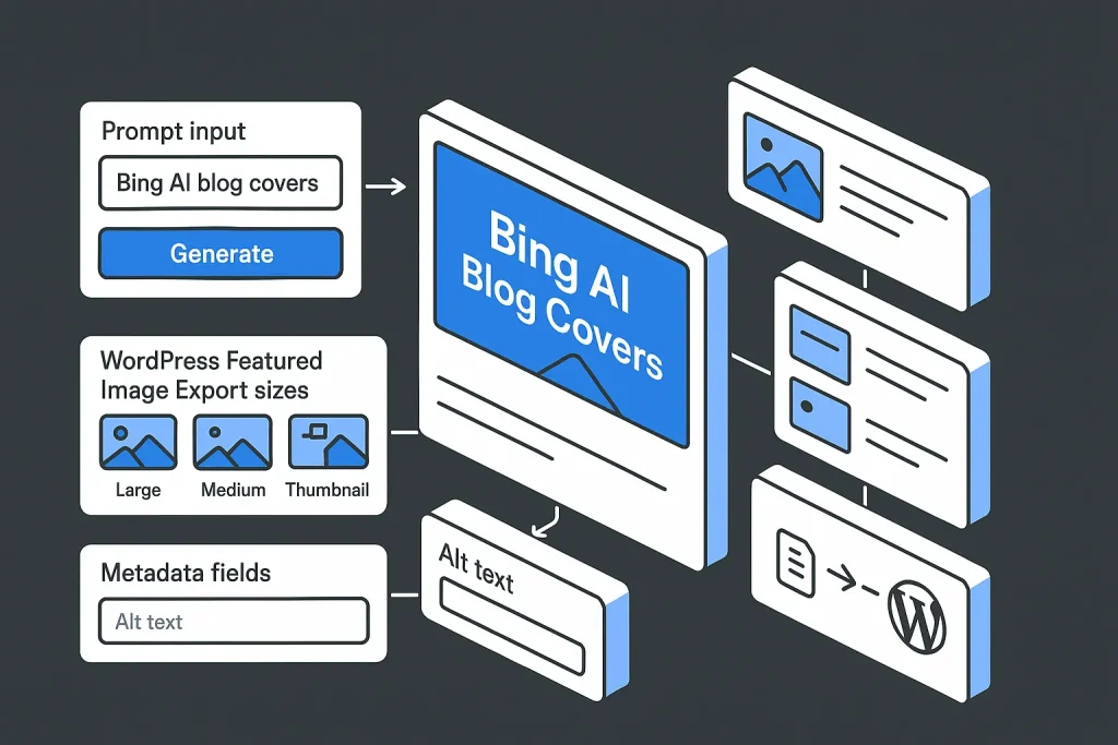
Manual blog cover production usually stalls at the same moment: the article is done, but the visual is still missing, off-brand, or sized badly for WordPress, Open Graph, and social previews. The bing image creator ai image generator gives content teams a fast way to produce custom graphics without waiting on a designer for every post, but speed by itself does not solve the real problem. A blog cover has to match the article angle, survive theme cropping, support accessibility metadata, and fit into a workflow you can repeat without friction.
For solo bloggers, agencies, and in-house SEO teams, the real upside of AI image generation is not novelty. It is production control. A useful cover should reinforce the post, keep visual consistency across categories, and shorten the gap between draft approval and publication. We have seen this firsthand: the prompt is rarely the only bottleneck, but it often becomes the first one.
In this guide, we break down where Bing Image Creator fits, how to prompt it well, what sizes to export, and where manual generation still creates drag in a content operation. We also compare that workflow with automated image handling inside a broader SEO publishing pipeline.
Those limits tell you more about the tool’s editorial usefulness than any flashy demo does.
What Is Bing Image Creator and When to Use It for Blog Covers
Bing Image Creator is Microsoft’s AI image generation interface for turning text prompts into visuals. For blog publishing, it is most useful when stock photography cannot cover the topic cleanly: abstract B2B ideas, software workflows, AI tooling, editorial pipelines, comparative diagrams, or niche article themes.
According to Microsoft Bing Image Creator, users can access the tool through Bing.com/create, the Bing mobile app, Copilot, and Bing Search sign-in flows. Microsoft also documents three generation models: MAI-Image-1, DALL-E 3, and GPT-4o. That matters because output behavior changes by model. Microsoft states that DALL-E 3 generates multiple images per creation, while MAI-Image-1 and GPT-4o generate one image per creation. If you upload an image for editing, Microsoft says the workflow switches to GPT-4o.
For blog covers, Bing Image Creator works best in five practical cases:
- When the article topic is too specific for stock libraries.
- When a team needs consistent visual direction across many posts.
- When publication speed matters more than custom illustration from scratch.
- When a content manager can define the visual brief but does not want to open design software.
- When the cover image supports SEO distribution surfaces such as archives, social previews, and newsletter embeds.
It is less effective when you need exact brand geometry, deterministic regeneration, or precise embedded headline typography. On our side, that is the line where a handy bing ai image workflow starts to behave like a workaround rather than a system. At that point, post-processing or a more automated publishing setup usually makes more sense.
Requirements and Access: Microsoft Account, Copilot, and Edge
The first operational requirement is simple and non-negotiable: Bing Image Creator requires a personal Microsoft account. For a freelancer, that is easy. For a team, it raises governance questions fast. Shared logins, prompt ownership, and asset traceability become process issues, not just account details.
Microsoft says users can start from Bing.com/create, inside the mobile app, or through Copilot and Bing Search sign-in flows. So yes, access is flexible. But there is still no dedicated editorial workspace built specifically for blog production.
For teams already deep in Microsoft tools, Copilot access feels familiar. For WordPress-first publishers, the friction shows up later: account access sits outside the CMS, generated images are not automatically attached to the right draft, and media naming hygiene is still manual. We consider that a bigger operational gap than most tutorials admit.
The table below summarizes the access model and what it means in practice.
| Access element | What Microsoft documents | Operational implication |
|---|---|---|
| Account | Personal Microsoft account required | Teams need a clear ownership model for prompts and assets |
| Entry points | Bing.com/create, Bing app, Copilot, Bing Search flows | Flexible access, but not a dedicated editorial asset pipeline |
| Model choice | MAI-Image-1, DALL-E 3, GPT-4o | Output planning should account for model-specific behavior |
| Daily speed tier | 15 free fast creations per day | Batch creation can slow down after the free fast allowance |
| Usage ceiling | Up to 200 prompts per 24 hours | Relevant for agencies or high-volume publishers |
For one site, these limits are manageable. For a scaled content operation, they shape throughput planning directly.
The graph makes the trade-off obvious: experimentation is easy, but large-scale manual production still needs discipline.
Prompt Basics for Blog Cover Designs (Brand, Topic, Tone, CTA)
The quality of a blog cover is usually decided before generation. Weak prompts create generic images. Strong prompts define editorial intent. A usable prompt for a blog cover should include four layers: subject, brand treatment, tone, and layout expectation.
A simple structure works well:
[Topic] + [visual metaphor or scene] + [style] + [brand palette] + [composition] + [clean background] + [no embedded text]
For example, if the article is about WordPress publishing automation, a weak prompt would be: “Create an AI image for blog post about WordPress SEO.” That is too broad. A stronger version would be: “Minimalist flat illustration of an automated WordPress publishing workflow, dashboard UI, content blocks moving into a CMS, dark neutral background with blue accents, editorial SaaS style, landscape composition, clean space for headline overlay, no extra text.”
That difference matters because Bing tends to fill ambiguity with decorative detail. Decorative detail often hurts blog-cover usability. Good covers need empty space, hierarchy, and a controlled focal point. On our projects, this is one of the clearest quality separators.
When building prompts, define these elements explicitly:
- Brand: preferred colors, interface aesthetic, illustration type, acceptable visual density.
- Topic: what the image should represent literally or metaphorically.
- Tone: technical, editorial, enterprise, minimal, modern, authoritative.
- CTA space: room for a blog title, category badge, or subtle brand mark.
If you skip brand direction, you get random style shifts. If you skip topic specificity, you get generic AI visuals. If you skip composition, you get images that are hard to crop for featured placements.
This is also where search variants like bing ai image and bing image creator free can create the wrong expectation. Yes, the tool may be accessible at an entry level, and many users look for bing image creator free for that reason. But free generation does not remove the need for prompt discipline. In practice, most wasted time comes from revision loops, not from the first click.

Advanced Prompting: Styles, Negative Prompts, and 16:9 Aspect Ratios
Once the basics are stable, better results come from constraint-based prompting. Blog covers are not gallery art. They need predictability.
Start with style control. Pick one visual system for a content cluster: flat SaaS illustration, soft 3D interface render, editorial collage, or icon-driven infographic look. Mixing styles from post to post weakens brand memory. We think this is where many AI-heavy blogs quietly lose authority, even when the writing is strong.
Then reduce noise using negative instructions. Bing Image Creator does not obey every exclusion perfectly, but negative phrasing still helps. Useful constraints include: “no clutter,” “no visible text,” “no watermarked stock-photo look,” “no extra hands,” “no distorted UI,” “no crowded background,” and “no photorealistic people” if your brand prefers interface-centered graphics.
Aspect ratio control matters just as much. Public Microsoft documentation in the material provided here does not clearly confirm a deterministic native 16:9 export guarantee across all workflows, so do not assume you can force exact widescreen output every time. Prompt instead for a landscape composition, widescreen layout, and safe central subject. Then crop for your CMS and social surfaces after generation.
For blog workflows, prompt examples should reflect the final publishing environment:
Example 1: “Minimal isometric illustration of keyword research and content workflow in a SaaS dashboard, dark background, blue accent lines, landscape editorial layout, generous empty area in the upper left for blog title, no embedded text, clean UI shapes, no people.”
Example 2: “3D software interface scene showing AI article generation and WordPress publishing, neutral palette with blue highlight, widescreen blog cover composition, smooth shadows, modern B2B style, uncluttered background, no logos, no text.”
Example 3: “Editorial technology graphic about SEO automation pipeline, connected modules for topic, keywords, content, image, and publish, flat vector style, dark graphite background, landscape frame, clean negative space for headline, no extra icons, no text.”
Search terms like bing ai image creator 3d and bing ai image creator 3d free reflect a real demand for more dimensional visuals without custom rendering work. That use case is valid. Still, the more complex the style, the more likely the output is to introduce artifacts. On our side, simple and controlled usually beats flashy. If you are testing bing ai image creator 3d or bing ai image creator 3d free for featured images, keep the scene restrained.
These reference widths are not identical deliverables, but they show why image planning has to account for both CMS display and social distribution.

Generate, Refine, and Upscale: Variations, Seeds, and Regeneration
The manual generation cycle has three stages: first pass, structured refinement, and final selection. Most teams lose time by staying too long in stage one and making tiny prompt edits without a review framework.
A better process is to evaluate first-pass outputs against a fixed checklist:
Composition: Is the focal area clear and crop-safe?
Topic relevance: Does the image reflect the article, not just generic “AI” aesthetics?
Brand fit: Does it match the site palette and content category?
Legibility zone: Is there enough calm space for a title overlay if needed?
Artifact risk: Are UI elements, hands, text fragments, or perspective cues broken?
Once you know what failed, refine the prompt in one direction at a time. Do not change subject, style, palette, and composition all at once. That makes learning impossible and increases prompt churn.
Be careful with claims around seeds and deterministic regeneration. The official material provided here does not clearly document precise public controls for seed-based repeatability in Bing Image Creator, so a reliable seed-driven workflow should not be assumed without direct product testing. The same applies to guaranteed native aspect-ratio behavior. Operationally, that means consistency comes from prompt frameworks and review standards, not exact reproducibility.
Upscaling is a practical question, not a marketing one. A cover image does not need extreme detail if the final surface is a compressed featured image card. What matters more is clean edges, balanced contrast, and how well the file survives compression after upload.
If you are editing an existing image, Microsoft says the workflow shifts to GPT-4o. That matters for teams that want to generate a base visual once and then iterate on a variant instead of rewriting the full prompt every time.

Export Correct Sizes for WordPress, Open Graph, and Social Previews
Generating the image is only half the job. The asset also has to work across WordPress themes, archive cards, Open Graph surfaces, and social cards. That calls for practical sizing, not one magic dimension.
According to WordPress featured images, featured images may appear in blog listings, search results, and social media previews. So one cover often serves several distribution surfaces. The same documentation notes that AI-generated featured images can be created directly in the editor, saved to the Media Library, and iterated by changing the prompt, style, or aspect ratio.
According to WordPress image sizes, there is no universal featured image size because themes define different display widths and crops. WordPress.com still suggests 1920×1080 pixels as the largest generally recommended featured image size for broad compatibility across themes and social platforms. At the same time, the Twenty Twenty theme documentation recommends 1980×1485 pixels for featured images, which shows how theme-specific guidance can differ from common widescreen conventions.
For X social previews, X card image specs document a 2:1 aspect ratio for Summary Card with Large Image, minimum dimensions of 300×157 pixels, a maximum file size under 5 MB, and supported formats including JPG, PNG, WEBP, and GIF. SVG is not supported.
The right approach is to separate source asset size from delivery variants. Generate or export a high-quality master, then derive CMS-ready and social-ready versions from it. We strongly prefer this over making unrelated versions for every platform.
The table below gives a practical export framework.
| Surface | Practical size target | Why it matters | Notes |
|---|---|---|---|
| WordPress master cover | 1920×1080 px | Broad compatibility across many themes and social uses | Good general-purpose baseline, but not universal |
| Theme-specific featured image | Check active theme docs | Some themes crop and display differently | Example: Twenty Twenty suggests 1980×1485 px |
| X large image card | 2:1 ratio, minimum 300×157 px | Controls preview shape on X | Keep under 5 MB; SVG unsupported |
| Fallback social asset | Derived crop from master | Preserves visual consistency | Avoid creating unrelated versions per platform |
The principle is simple: one generation prompt, several controlled exports.
Add Text Overlays and Brand Elements the Right Way
Most AI-generated blog covers fail when teams ask the model to render the final headline text inside the image. Letterforms break. Spacing drifts. Typography becomes inconsistent from post to post. For production use, the safer method is to generate a clean visual with deliberate empty space and then add text overlays in a separate tool or templated publishing environment.
That gives you four clear advantages:
Consistency: the same headline style can be used across the entire blog.
Readability: designers or editors control contrast and line breaks.
Localization: title language can change without regenerating the image.
Reuse: the same base image can support article pages, category cards, and social variants.
Brand elements should also be applied carefully. A subtle badge, shape system, or color strip is usually enough. Large logos or intrusive labels reduce editorial quality and can hurt click-through if the cover starts to look like a display ad.
Keep the composition modular. The base AI image should provide context. Overlay text should provide article specificity. Brand elements should confirm origin, not dominate the frame. We have found this split far more reliable than trying to make the model do everything at once.
This matters even more for use cases where people search terms like bing image creator nama or interface-adjacent variants such as bing ai image creator whatsapp. Those searches often signal a desire for quick customization or repurposing. In a publishing workflow, though, speed should not replace layout control. If you are experimenting with bing ai image creator whatsapp style repurposing ideas, keep the editorial version separate from the fast-share version.
Rights, Safety, and Content Policy: What You Can Publish Commercially
Commercial use questions around AI imagery should be handled conservatively. Microsoft states that every Bing Image Creator image includes a visible watermark in the bottom-left corner and content credentials based on the C2PA standard. In practice, that means your published graphic carries visible and metadata-level AI-origin signals by default.
Microsoft also says harmful prompts can be blocked automatically, and repeated violations of the content policy can lead to temporary suspension or permanent restriction. That matters for agencies and publishers because account reliability is part of operations. Prompt experiments that repeatedly push policy boundaries are not just a moderation issue. They create workflow risk.
On licensing, the nuance matters. According to Microsoft Support Copilot, images suggested by Copilot in Microsoft 365 or Office apps can be used for anything permitted by the applicable license. But the Bing Image Creator pages referenced in the provided source set do not present one equally simple blanket commercial-use rule. So publishers should review the current product terms directly at the time of use and avoid overstating certainty where the public wording is narrower.
For risk-aware content teams, the safe policy is:
- Review current Microsoft terms before using generated assets at scale.
- Avoid regulated, sensitive, or brand-imitation prompts.
- Keep an internal record of generated assets and their intended use.
- Use alt text and captions that describe the visual honestly as published media, not as documentary photography.
AI generation speeds up production, but governance still matters. On our view, this is one of the easiest areas to underestimate until a team starts publishing at volume.
This chart combines the product facts that matter most in operations. Frankly, they are more useful than generic quality claims.

Manual Bing Workflow vs Autopilot SEO’s Automatic Image Matching
Manual image generation works well when you publish occasionally and want direct control over every prompt. It becomes inefficient when content volume rises. The work is not only in generation. It is in choosing the right visual angle, adjusting prompts, exporting sizes, renaming files, adding alt text, uploading to WordPress, and confirming the image matches the article intent.
That is the broader operational problem discussed in full SEO Autopilot: point tools solve one task, but content growth depends on pipeline design. The same issue appears when comparing image generation as a standalone step versus image generation inside an SEO publishing workflow.
With manual Bing use, every cover is a micro-project. With automation, image handling becomes one stage in a connected sequence: topic selection, keyword planning, outline, article generation, image matching or generation, metadata, and publication. That is much closer to how scaling teams actually work.
SEO Autopilot is built around that pipeline logic. Instead of treating visuals as an afterthought, the platform integrates article production with content operations so the image stage aligns with the draft, topic, and publishing step. For teams that need to move from ideation to a published post without switching constantly between tools, the official client site at SEO Autopilot is the more relevant model than a purely manual prompt workflow.
The real difference is not just speed. It is reduced coordination overhead. A blog cover selected or generated in context is less likely to drift from the article angle, and the publishing process stays inside one operating system for content rather than several disconnected interfaces. We consider that the stronger long-term advantage.
This is closely related to the shift from isolated tools to a content pipeline for SEO growth. Teams that publish at scale usually outgrow one-off prompt sessions long before they outgrow the need for custom visuals.
Workflow Tips: Batching, Naming, Alt Text, and Media Library Hygiene
Once image generation becomes a recurring task, process discipline saves more time than better prompting alone.
Batch by content cluster. Generate covers in groups for related topics. That improves visual consistency because prompts share the same base style and brand logic.
Use a naming convention. A practical pattern is: category-keyword-angle-version. Example: seo-automation-bing-image-cover-v2. This reduces confusion inside the Media Library and makes reuse easier.
Separate source from delivery assets. Keep a master visual, then export platform-specific derivatives only if required by the active theme or social workflow.
Write alt text as metadata, not decoration. X documentation sets a maximum of 420 characters for image alt text on cards. That does not mean longer is better. For blog covers, alt text should describe the image accurately, mention the article context if useful, and avoid keyword stuffing.
Track generation history. Save the final prompt with the article record or media item notes. This makes later re-creation easier even when deterministic seeds are unavailable or undocumented.
Keep the CMS clean. Delete failed exports, drafts, and irrelevant variations. A cluttered Media Library slows editors down and increases the chance of attaching the wrong asset to a live post.
These habits align well with broader WordPress content workflow discipline. The image is not a separate universe. It is one more asset in the same editorial system. On our side, this is where small teams can punch above their weight.
Troubleshooting Quality Issues: Anatomy, Artifacts, and Style Drift
Most quality problems in AI-generated covers fall into a small set of categories.
Anatomy errors: hands, faces, posture, or perspective distortions. The fix is usually to remove people entirely from the brief unless the scene truly requires them.
Interface artifacts: fake text, broken icons, impossible dashboards, unreadable widgets. For SaaS and SEO content, request simplified UI shapes rather than dense software screenshots generated from imagination.
Style drift: one post gets glossy 3D, the next gets cartoon flat vector, the next looks photorealistic. The fix is a documented style library with reusable prompt scaffolding.
Overcrowding: too many objects, too much symbolism, not enough empty space. The fix is to specify a single focal subject and “clean background” or “minimal composition.”
Weak topic relevance: the output says “AI” but not the actual article theme. The fix is to include the content domain in the prompt: keyword research, WordPress publishing, semantic clustering, analytics dashboard, internal linking, or editorial automation.
Poor crop behavior: the image looks acceptable full-size but breaks inside a theme thumbnail. The fix is to keep key elements away from edges and test center-safe compositions.
When troubleshooting, avoid restarting from zero immediately. Adjust one variable at a time: scene, style, density, color, or composition. That preserves learning and makes your prompt framework stronger over time. We have noticed that teams who document these fixes improve much faster than teams who just keep regenerating.
On our reading, the bing image creator ai image generator is genuinely useful for blog cover production when the goal is speed with reasonable control, not pixel-perfect design. It works best when prompts are structured, exports are standardized, and the image step is treated as part of an editorial system rather than a last-minute creative detour. The biggest risk is not image quality alone; it is workflow sprawl, where every post becomes a small manual project. If you are using bing image creator ai image generator repeatedly, the real gains come from process discipline, not from chasing one perfect prompt.
Our forecast is straightforward. Tools like this will keep improving in style control and editing, but manual prompt workflows will still hit scale limits for serious publishers. We expect the strongest setups to combine AI generation with template logic, media governance, and CMS-connected automation. Businesses that prepare for that shift now will move faster without sacrificing consistency.
FAQ
Is Bing Image Creator free for commercial blog use?
Bing Image Creator includes free usage elements, including 15 free fast image creations per day according to Microsoft, so people searching bing image creator free are not wrong about entry-level access. But commercial-use certainty should still be reviewed carefully. The source set here does not provide one simple blanket Bing Image Creator commercial-use rule in the same way Microsoft documents some Copilot image suggestions, so publishers should verify current terms before large-scale commercial deployment.
How do I get a 16:9 blog cover from Bing Image Creator?
The safest method is to prompt for a landscape or widescreen composition and then crop the selected image to 16:9 in your design or CMS workflow. Public documentation in the provided source set does not clearly confirm deterministic native 16:9 export guarantees across all Bing Image Creator workflows, so post-generation cropping remains the reliable method.
Can Bing Image Creator add text overlays reliably for headlines?
Not reliably enough for production-grade blog branding. We recommend generating a clean image with negative space and adding the headline in a separate design step so typography, contrast, and line breaks stay consistent across the site.
What featured image and OG sizes should I export for WordPress?
There is no universal WordPress featured image size because themes vary, but 1920×1080 is a strong practical master size for many workflows. Then check your theme documentation for specific guidance and derive social variants as needed; for X large image cards, use a 2:1 ratio and keep the file under 5 MB.
Why use Autopilot SEO instead of manual Bing prompts for blog graphics?
Manual Bing prompts are workable for occasional posts, but they create repetitive overhead in larger content operations. SEO Autopilot is more useful when you want image selection or generation to sit inside a connected SEO publishing workflow that also handles topic planning, article creation, optimization, and WordPress publication.