
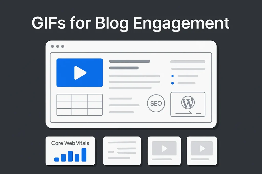
Attention on blog pages is won through clarity, motion, and structure. A well-used gif generator gives marketers a practical way to explain movement, highlight UI interactions, and make dense posts easier to scan without turning the page into a bloated media asset. For blog content that teaches, compares, or demonstrates, short animated loops do something static screenshots simply cannot: they show a sequence, not just a frozen state.
The upside is practical, not decorative. Animated GIFs work across browsers and are easy to embed, which keeps production simple for content teams. But they are not performance-neutral. That convenience is exactly why teams overuse them. On our side, we see the same mistake often: a useful format gets treated like a default. Strong execution depends on using motion only where it improves understanding, then balancing that motion with compression, captions, alt text, and structured content blocks.
That is the real rule. Use animation to clarify, not to impress. A short loop beside a process table, a product walkthrough above a bullet list, or a reaction-style visual near a CTA can improve comprehension and scanning behavior when the media is intentional.

Why animated GIFs keep readers engaged on blog pages
Engagement on editorial pages is not some fuzzy branding signal. It shows up in scroll depth, section completion, click behavior, and in whether a reader understands the next step without friction. Animated GIFs help because they compress explanation into a few seconds of repeatable motion. That matters most when a post covers interface workflows, tactical steps, or product actions that are awkward to explain with screenshots alone.
Scanning behavior is the main reason this works. Readers move fast. They look for anchors: headlines, lists, captions, tables, images, highlighted statements, and visible demonstrations. A looped visual becomes one of those anchors. It slows the scan at the right moment and gives context to the paragraph around it. Used properly, the GIF does not replace the copy. It gives the copy a better chance to be consumed.
The strongest examples are operational. A SaaS tutorial can show where a button appears after a filter is applied. A technical guide can show how a settings panel changes after one option is enabled. A content marketing article can show how to rearrange modules in WordPress. In each case, a static image shows a frame, while animation shows cause and effect.
There is also a retention benefit. Motion helps readers remember process order because it introduces sequence. A short animation can reinforce “step one, then step two, then result” more directly than three separate screenshots. On our experience, this matters most in posts aimed at buyers or practitioners who want fast comprehension, not a long visual detour.
On a practical page, GIFs tend to work best as one engagement device among several. Pair them with concise lists, clear subheads, and structured tables. On our погляд, that mix creates a stronger reading flow than animation alone ever will.

When to use GIFs vs images or short video
Not every moving asset should be a GIF. Pick the wrong format and you get bigger files, weaker visual quality, and slower pages. The format decision should start with purpose, not habit.
Use a GIF when the motion is short, repetitive, and instructional. That includes cursor movements, menu reveals, hover effects, drag-and-drop previews, tooltip behavior, or a compact before/after loop. In those cases, the reader benefits from instant replay that starts automatically and needs no player controls.
Use a static image when one frame is enough. A chart, page layout, diagram, or final state of a settings screen usually does not need motion. If a reader can understand the idea from a single frame, animation adds weight without adding meaning.
Use MP4, WebM, WebP, or AVIF when the animation is longer, more detailed, or visually complex. Google’s web.dev guidance on GIF notes that GIF is typically much larger than modern animation alternatives. MDN’s image format reference makes a similar point. So if a long product walkthrough is exported as GIF, that is usually the wrong call even if the embed is easy.
The simplest rule is operational. If the content needs controls, audio, high detail, or longer duration, export to video. If it needs instant looping for a five-second explanation, a GIF may be enough. We consider this one of the most common editorial judgment calls in product-led content.
| Format choice | Best use on blogs | Main trade-off |
|---|---|---|
| GIF | Short loops, UI demos, simple reactions, instant replay | Large files and limited color depth |
| PNG/JPG | Diagrams, screenshots, final states, cover graphics | No motion |
| MP4/WebM | Longer demos, richer animation, complex walkthroughs | Requires video handling and player decisions |
| WebP/AVIF animation | Modern lightweight animated assets where supported | Workflow complexity may be higher than simple GIF export |
The correct format is less about trends and more about page economics: every asset has to justify its weight.
Top use cases for blog GIFs: micro-demos, tutorials, reactions, UI loops
The best-performing blog GIFs usually serve a narrow editorial function. They are not generic motion assets sprinkled into a page to make it feel lively. They solve a communication problem.
Micro-demos
A micro-demo shows one action and one result. For example, a SaaS post about filtering reports can show the exact menu interaction required to isolate a segment. The loop is short, focused, and easy to replay. This is an ideal use case for an animated gif generator or gif generator online tool because the output does not need cinematic polish. It needs clarity.
Tutorial support
Tutorials get stronger when each critical step has a visual proof point. A GIF can sit directly below a step heading and remove ambiguity from the instruction. This is especially useful when product interfaces change state after a click, hover, or expansion. In that context, a gif generator from video is often the fastest route: record a screen clip, trim it, crop it tightly, and export only the essential motion.
Before-and-after comparisons
A looping comparison helps show transformation. Examples include old page layout vs optimized layout, manual workflow vs automated workflow, or weak internal linking vs structured internal linking. The motion does not need to be flashy. It just needs to alternate clearly between two states.
UI loops for software content
B2B and SaaS blogs often explain product flows, integrations, dashboards, and settings. Short UI loops work because they show interaction density without demanding video playback. That makes them useful for comparison posts, onboarding articles, and documentation-lite content. We have noticed that readers tolerate these loops far better than autoplay video because the intent is obvious immediately.
Branded reaction moments
Reaction-style GIFs can work near CTA blocks or summary moments, but this is also the easiest category to misuse. For business blogs, branded reaction loops should stay subtle and relevant. They should support tone and emphasis, not drag the page into meme culture unless the brand voice clearly allows it.

Creating on-brand GIFs with a GIF generator: a step-by-step workflow
The production process matters more than the tool label. Whether a team uses a gif editor, a gif maker free online, an animated gif generator online, or a mainstream giphy gif maker, consistency comes from workflow discipline.
- Start with one communication goal. Decide what the loop must explain. “Show how to open advanced filters” is specific. “Make the section more engaging” is not enough for production.
- Capture only the necessary frames. Record a short screen clip or assemble a sequence from screenshots. If the source is a short clip, a gif generator from video is usually the most efficient workflow. In some cases, a gif generator from youtube can also help when you are repurposing a public demo source you have rights to use.
- Crop aggressively. Remove interface areas that do not help the reader. Focus on the active panel, pointer movement, or interaction zone.
- Trim the sequence. Keep only the smallest loop that still makes the action understandable. Dead seconds at the start and end add weight and reduce clarity.
- Add light text overlays when needed. A gif generator with text or even an animated text generator gif workflow can help label the action with two to four words. The overlay should clarify the step, not repeat the heading above it.
- Apply brand controls. Use consistent accent colors, caption style, cursor visibility, and frame pacing. For teams with recurring blog series, this matters because media consistency shapes perceived editorial quality.
- Export and compare versions. Test a compact GIF against a short MP4 or WebM when the asset feels heavy. The default format should be challenged before publication.
- Write metadata. Add descriptive file names, alt text, captions, and surrounding context so the asset works for both accessibility and SEO.
Tool flexibility is much better today than it was a few years ago. Official product documentation for GIPHY’s desktop GIF creation workflow shows support for common source files such as JPG, PNG, GIF, MP4, MOV, WebM, and even YouTube links in desktop creation flow. That makes a modern gif online creator more useful than a novelty tool. It can fit directly into a blogger’s editorial production chain.
A repeatable workflow is what separates a helpful GIF library from a pile of inconsistent animated assets. We would argue this matters more than the tool’s homepage promise.
Optimization fundamentals: file size, dimensions, loop behavior, compression
Performance problems usually start before publishing, not after. If the source clip is too long, the crop is too wide, or the export settings are careless, no plugin will fully rescue the asset.
File size discipline
The first rule is to keep the animation short. Every unnecessary second increases weight. Every unnecessary frame increases weight. Every unnecessary pixel increases weight. A high quality gif generator is useful only if “quality” means clarity per byte, not maximum visual richness.
Dimension control
Do not export GIFs at full-screen dimensions unless the instructional value truly depends on it. Most blog demos work better when tightly cropped around the interaction area. Smaller dimensions improve load time and sharpen focus.
Loop behavior
Infinite looping is common, but not always ideal. If the motion distracts, a shorter loop or a limited number of repeats may work better. The right choice depends on whether the animation supports understanding or pulls attention away from reading. On our side, we usually prefer restraint here.
Compression choices
Because GIF is limited to 256 colors, reducing palette complexity can help without destroying legibility. This is one reason UI demos often compress better than photographic sequences. Flat-color interfaces, cursor movements, and simple transitions are naturally suited to the format.
| Optimization factor | Good practice | What to avoid |
|---|---|---|
| Duration | Short micro-loop focused on one action | Long walkthrough exported as GIF |
| Crop | Tight frame around interaction | Full screen with dead space |
| Color complexity | Simple UI or low-complexity motion | Photo-heavy scenes with gradients and noise |
| Placement | Mid-article support asset | Large hero media without testing |
Optimization is easier when teams plan the asset for the article instead of repurposing a social-media animation into a blog context. That shortcut rarely ages well.

Accessibility and UX: alt text, motion sensitivity, captions, contrast
Accessible animation is not optional. It is part of publishing quality. A GIF that helps one reader but creates confusion or discomfort for another is not a successful content asset.
Start with motion sensitivity. W3C WCAG guidance on flashing content sets a threshold of no more than three flashes per second, and looping content should be evaluated while looping. That matters directly for blog GIFs because a harmless-looking export can become problematic once it repeats continuously. Motion-heavy assets should be reviewed for intensity, not just aesthetics.
Alt text matters for two reasons. First, it improves accessibility for readers using assistive technologies. Second, descriptive alt text helps search engines understand what the visual contains. For informational GIFs, alt text should describe the action and result, not just say “animated GIF” or repeat the article title.
Captions improve usability too. A short caption can tell the reader what to notice in the loop, which is especially useful in software tutorials. That is a better editorial choice than expecting the reader to infer the point of the animation alone.
Contrast and text overlays need the same care. If a gif generator with text is used to add labels or directional cues, the overlay must remain legible against the motion beneath it. Thin fonts, weak contrast, or too much text make the asset harder to understand. A polished animated gif maker free online can help with speed, but it will not fix poor judgment about readability.
For editorial teams, the standard can stay simple: if a reader cannot understand the instructional point without perfect vision, stable motion tolerance, and context from surrounding paragraphs, the media needs work.
SEO and performance: Core Web Vitals, lazy-loading, CDNs, and safe embedding
GIFs affect SEO indirectly through performance and user experience. They do not rank a page by themselves, but they can absolutely help or hurt the signals behind page quality. This is where many blogs get animated media wrong.
Google’s Core Web Vitals guidance defines good Largest Contentful Paint as 2.5 seconds or less. If a large animated asset sits near the top of a page, it can delay the moment when the page feels usable. That is especially risky when teams treat a GIF as a hero element instead of a supporting asset.
Lazy-loading is not an automatic fix. web.dev’s analysis of lazy loading and LCP warns that overusing lazy-loading can hurt Largest Contentful Paint. In practice, above-the-fold animated visuals should be tested rather than lazy-loaded by default. Mid-article assets are a different story and are generally safer candidates for deferred loading.
CDN delivery helps because media files benefit from caching and geographically distributed delivery. Even so, a CDN does not excuse oversized assets. It reduces transfer friction; it does not erase weak export decisions.
Safe embedding means more than dropping a file into WordPress. It includes width management, compression, metadata, responsive display, and checking how the asset behaves on mobile. A gif generator online can simplify production, but publishing quality still depends on technical review. We consider this one of those unglamorous steps that separates decent content operations from serious ones.
The simplest SEO rule is blunt: motion has to justify its performance cost. If it does not improve understanding, it should not be on the page.

Placement strategy: where GIFs lift CTR, dwell time, and conversions
Placement determines whether a GIF clarifies or distracts. The strongest placements are usually next to decision points in the reading journey.
After a process subheading
This is the most common high-value placement. The heading frames the task, the paragraph introduces the logic, and the GIF shows the action. The sequence feels natural and supports comprehension.
Before a CTA that requires confidence
If a conversion depends on the reader believing a workflow is easy, a short loop can reduce hesitation. This is common in software sign-up pages, tool comparisons, and workflow explainers.
Inside product comparison sections
When showing feature differences, a loop can demonstrate speed or simplicity better than text alone. This works particularly well when the rest of the section uses a structured comparison layout.
Near high-abandonment sections
Analytics often show where readers drop. If a section contains dense instructions or abstract explanation, a micro-demo can help restore momentum. The asset should be inserted to resolve friction, not to add visual variety.
CTR and dwell time improve when animation supports the next action. Conversion influence is rarely caused by the GIF alone. It comes from the GIF working with a good heading, a clear CTA, and a strong surrounding explanation. On our погляд, this is exactly why random placement underperforms.
A/B testing GIF impact: metrics, cohorts, and decision thresholds
GIF strategy should be tested, not defended by taste. The right measurement model compares content versions with and without animation under similar traffic conditions.
Useful primary metrics include scroll depth, click-through rate on in-article CTAs, completion rate for long sections, and goal completions such as demo requests or sign-ups. Secondary metrics can include time on page, but it should not be treated as the only indicator because longer time can signal confusion just as easily as engagement.
Cohort control matters. Compare pages with similar intent, traffic source, and topic complexity. A blog tutorial with strong product intent behaves differently from a top-of-funnel educational post.
Decision thresholds should be pragmatic. If a GIF increases section completion or CTA clicks without harming performance metrics, keep it. If it adds weight and yields no reading or conversion improvement, remove it or replace it with a lighter format.
The testing objective is not to prove that motion always wins. It is to identify where motion earns its place in the content system. We think that is a healthier mindset than treating every visual trend as a universal best practice.
Pairing GIFs with structure: tables, bullet points, and scannability with Autopilot SEO
GIFs work best when paired with structure. For us, this is the key editorial principle in the whole topic. Animation should sit inside a readable framework of headings, bullets, tables, and concise explanatory copy.
That is where content automation can improve results. A workflow that produces clean section hierarchy, structured lists, semantic targeting, and publish-ready formatting makes animated media easier to integrate without turning the post chaotic. This is also why GIF-heavy posts often perform better when the rest of the page is calm and well organized.
For example, a tutorial section can present one short GIF, then follow with bullet points summarizing what the reader just saw. A comparison section can show a loop next to a table that explains the implications. A long-form educational article can use animated examples while preserving scannability through table structure and modular subsections.
Teams that already create visual content may also benefit from refining static graphic workflows. For related approaches, see these tips for getting strong blog visuals from AI image prompts and this look at Google image generator options for blog graphics. The same editorial principle applies across formats: visuals support the content structure rather than replacing it.
| Content element | Role in scannability | Best pairing with GIF |
|---|---|---|
| Bullet points | Reduce reading friction | Post-demo summary of key actions |
| Tables | Make comparison fast to scan | Feature, workflow, or format comparison |
| Short captions | Direct attention to the right detail | Instructional UI loops |
| Subheads | Create navigation anchors | One GIF per discrete task section |
The strongest content systems do not choose between structure and motion. They combine them deliberately.
Tool selection criteria for a GIF generator: text overlays, video import, brand kit, export
Choosing a gif generator should be based on workflow fit, not on the size of the template gallery. For blog operations, the practical features matter most.
Video import quality
A strong gif generator from video should accept common source formats and make trimming easy. If the team records screen clips frequently, efficient import is a higher priority than decorative stickers or effects.
Text overlay controls
A gif generator with text is useful when captions need to be burned into the asset for quick interpretation. Controls should allow readable sizing, contrast, and positioning without clutter.
Image sequence workflow
A gif maker from images or gif maker from pictures matters for teams creating frame-by-frame explainers or exporting simple motion from design assets. Some workflows also need a gif maker from gif function to remix or shorten existing branded loops without rebuilding them from scratch. This is common in product marketing and feature launch content.
Export flexibility
The tool should make it easy to compare GIF against alternative export formats. If a platform forces everything into GIF, it encourages weak performance decisions.
Brand consistency
Teams publishing frequently should look for reusable styles, fonts, color presets, or basic brand-kit support. Even a lightweight online animated gif maker becomes more valuable when it reduces repeated formatting work.
Editing speed
Blog production benefits from simplicity. A free ai gif generator, a gif maker free online, or other tools marketed at speed can sound attractive, but if the interface produces inconsistent exports or poor compression control, the operational benefit disappears quickly. The same goes for many flashy gif creators: speed is useful only when the output is publishable.
Tool selection should answer one question: does it shorten the distance from source footage to publish-ready media without weakening quality control?
Compliance and sourcing: licensing, attribution, and brand safety in GIF usage
Not every GIF found online is safe to republish in a commercial blog post. Licensing, attribution requirements, and brand context should be checked before publication.
For original product demos and tutorial loops, the safest route is to create the asset in-house. That avoids licensing ambiguity and ensures the visual reflects the current product state.
For third-party reaction or culture-driven GIFs, brand risk rises quickly. Even if the embed is easy, the asset may introduce copyright concerns, tonal mismatch, or context that ages badly. Business blogs should be especially careful here. On our погляд, this is one of those small editorial shortcuts that can create outsized trust problems later.
Brand safety also includes product accuracy. A GIF showing an outdated interface, deprecated workflow, or non-compliant process creates a credibility problem even if the file itself is licensed correctly.
The standard should stay simple: if the team cannot confirm ownership, reuse rights, and brand fit, the asset should not be published.
WordPress implementation checklist: formats, compression plugins, and media settings
WordPress makes image publishing easy, but that simplicity can hide weak media handling. GIFs should be treated as performance-sensitive assets at the CMS level.
Start with file naming. Use descriptive names tied to the action shown in the loop. Then check dimensions before upload rather than relying on WordPress to solve oversized media through display scaling alone.
Compression support varies by workflow, and not all plugins improve animated assets equally. The main goal is to reduce payload before upload, then serve the file cleanly through the theme and media stack.
Responsive layout matters too. A GIF that looks sharp and clear on desktop can become cramped or illegible on mobile if the crop is too tight or the text overlay too small.
Cover graphics and supporting visuals often need a separate workflow from animated assets. For related image creation approaches, this guide to the Bing Image Creator workflow for blog covers is useful when static blog visuals and animated media are planned together.
In operational terms, a WordPress GIF checklist should include source file review, responsive preview, alt text entry, caption decision, placement validation, and post-publication performance testing. If a team uses an animated gif generator online or a gif editor upstream, that checklist still applies.
Measurement framework: tracking engagement, scroll depth, and goal completions
GIF adoption becomes strategic only when the team measures outcomes consistently. The baseline framework should cover content interaction, performance, and business action.
On the interaction side, monitor scroll depth by section, CTA click rates near GIF placements, and completion rates for tutorial modules. If the blog uses heatmaps or event tracking, compare whether users pause more often around instructional loops than around static screenshots.
On the performance side, review load behavior, mobile responsiveness, and whether the animated asset coincides with weaker Core Web Vitals patterns on key templates.
On the business side, tie GIF-supported sections to outcomes such as newsletter sign-ups, demo requests, feature page clicks, or product trial starts. This helps separate “the asset looked engaging” from “the asset supported a conversion path.”
Over time, the team can build internal rules. For instance, UI tutorials may justify one short loop per major section, while informational thought-leadership posts may benefit more from static graphics plus one demonstration near the CTA. That level of editorial discipline usually produces better results than assuming every post needs more motion.
How SEO Autopilot fits a structured visual content workflow
GIFs are most useful when the surrounding article is already well structured. That is where automation has real value for B2B content teams. Instead of spending manual effort on semantic planning, article structure, bullet organization, internal linking logic, and WordPress publishing steps, teams can use SEO Autopilot to streamline the production of SEO-focused content that is ready for structured media insertion.
For agencies, bloggers, and in-house marketing teams, the advantage is operational. SEO Autopilot helps generate topic structure, semantic coverage, article drafts, visual planning context, and publish-ready workflows for WordPress. In practice, that makes it easier to place a GIF exactly where it supports scannability, then reinforce it with concise bullets, tables, and internal links instead of building each article manually from scratch.
The result is not “AI instead of editorial judgment.” It is a faster content system where motion assets, structure, and SEO can work together inside one controlled workflow.
We think the practical takeaway is straightforward: GIFs work best when they behave like editorial tools, not decoration. The strongest results usually come from short instructional loops, disciplined placement, and a workflow that treats performance, accessibility, and structure as part of the same job. Businesses that approach GIFs this way tend to get more value from fewer assets, which is usually the smarter trade.
Looking ahead, we expect teams to rely less on raw GIF volume and more on selective, measured use inside structured content systems. Modern formats, lighter exports, and smarter tooling will keep pushing blogs toward efficiency. But the core principle is unlikely to change: motion will keep earning its place only when it makes the page easier to understand.
FAQ
Do GIFs hurt page speed and SEO?
They can. GIFs are often heavier than modern animated formats, so oversized files can slow load speed and indirectly weaken SEO through poorer user experience and Core Web Vitals. The safe move is to use short, compressed loops only where motion adds obvious value.
What size and dimensions should a blog GIF be?
There is no universal size, but smaller is usually better. Crop tightly around the action, avoid full-screen exports, and use only the dimensions needed for readability on both desktop and mobile.
Is it better to embed a GIF or convert to MP4/WebM?
For short UI loops and instant replay, a GIF can be convenient. For longer or visually richer animation, MP4 or WebM is usually the better option because file size and playback efficiency are typically stronger.
How many GIFs should I use per blog post?
Use only as many as the article can justify. Most posts benefit from a few purposeful animated assets tied to key instructional moments rather than a page full of decorative loops.
How do I add text or branding to a GIF quickly?
Use a gif generator with text, a lightweight gif editor, or an online animated gif maker that supports overlays, trimming, and color consistency. Keep the text short, high-contrast, and aligned with the section so the reader understands the action immediately.