
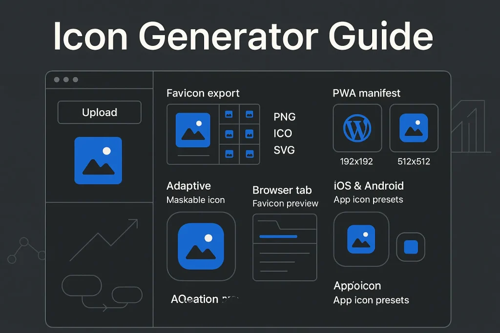
For bloggers, an icon generator is not a cosmetic extra. It is the fastest way to standardize the small visual assets that show up in browser tabs, bookmarks, WordPress site settings, app manifests, pinned surfaces, and mobile install prompts. The operational problem is simple: one logo or source mark has to be exported into multiple formats, multiple sizes, and multiple platform-specific variants without blurring, clipping, or brand drift.
We see this mistake often: teams spend hours polishing headers and hero images, then treat icons as an afterthought. That is backwards. A reliable setup covers favicon output, WordPress Site Icon requirements, PWA manifest icons, Apple-friendly master assets, Android adaptive constraints, and a validation routine that catches caching and rendering issues before they hit production. For bloggers managing content at scale, the icon layer should be repeatable, documented, and easy to regenerate whenever the brand mark changes.
What is an icon generator and when to use it
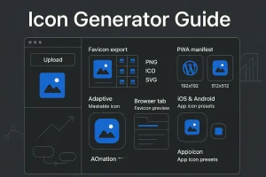
An icon generator is a tool that converts one source image, logo, or symbol into a set of web-ready and app-ready icon files. Depending on the tool, it may crop the image, generate transparent or solid backgrounds, resize into multiple dimensions, export ICO, PNG, and SVG files, and create supporting files such as a web app manifest. In practice, it removes one of the most repetitive jobs in front-end publishing.
For a blogger, the need usually appears in four situations: launching a new site, refreshing a visual identity, enabling PWA functionality, or cleaning up an old favicon setup that was added manually years ago. The last case is especially common. Many blogs still rely on a single outdated favicon file and have no proper assets for high-resolution devices, Android surfaces, or WordPress native Site Icon settings.
According to MDN’s favicon reference, a favicon is typically associated with the browser tab and is commonly stored in GIF, PNG, or ICO formats. That definition is still useful, but modern icon delivery goes well beyond one 16×16 asset. On our side, we would only call a tool truly useful if it handles the full export matrix from one source file.

A strong generator is worth using when manual export would introduce inconsistency. If you run one blog, manual work is possible but inefficient. If you run several blogs, client sites, or multilingual properties, automation is the safer choice because it cuts repeated resizing and naming errors. We consider that a practical efficiency gain, not a design luxury.
Icon types for bloggers: favicon, social avatars, app/PWA sets
Not every icon serves the same context. Bloggers often throw several use cases under the word “favicon,” and that is where confusion starts. The cleaner approach is to separate icon types by destination and behavior.
Favicon
The favicon is the browser-facing icon shown in tabs, bookmark bars, and some history views. Historically, 16×16 was the expected baseline, and that still matters for very small display contexts. A favicon generator usually exports either ICO, PNG, or both so the site stays compatible across browsers and surfaces.
WordPress Site Icon
WordPress now makes favicon handling easier for site owners. The platform recommends a square Site Icon that is at least 512×512 pixels, with PNG as the recommended format, as documented in the WordPress Site Icon documentation. For bloggers, this removes a lot of manual setup in standard environments.
PWA and install icons
If your blog behaves like a Progressive Web App, the icon requirements expand. Chrome’s Lighthouse installability audit requires a manifest that includes both 192×192 px and 512×512 px icons, as described in the Lighthouse installable manifest guidance. This is where a basic free favicon generator may stop being enough. You need manifest-ready outputs, and ideally maskable variants too.
Apple and Android platform sets
For app-like deployment or broader brand consistency, platform presets matter. Apple’s Human Interface Guidelines specify a 1024×1024 layout size for iOS, iPadOS, and macOS app icons, while watchOS and tvOS have their own larger or differently shaped layouts. Android adaptive icons follow different logic than standard favicons, including safe zones and layered foreground/background handling.
The practical takeaway is straightforward: bloggers should treat the favicon, Site Icon, and PWA set as related but distinct deliverables. In our experience, mixing them into one vague “icon file” is exactly how messy implementations happen.

The export matrix below is the most useful baseline for bloggers comparing an icon generator online tool.
| Use case | Recommended sizes | Preferred formats | Why it matters |
|---|---|---|---|
| Browser favicon | 16×16, 32×32, 48×48 | ICO, PNG | Covers tiny tab and bookmark contexts |
| WordPress Site Icon | 512×512 minimum | PNG | Feeds WordPress native icon workflow |
| PWA manifest | 192×192, 512×512 | PNG, optional SVG support | Supports installability and high-resolution display |
| App store or platform set | 1024×1024 and platform presets | PNG, SVG source | Keeps one master asset scalable across ecosystems |
One source icon can serve all of these contexts, but only if the generator exports correctly and the artwork is designed to survive aggressive downscaling.
Selection criteria: formats, sizes, exports, brand consistency
When evaluating an icon creator online tool, bloggers should focus less on the front-page template gallery and more on export discipline. The real question is not whether the tool can produce a nice preview. It is whether the output can be deployed reliably on WordPress, in HTML, and inside a PWA manifest.
Format coverage
A practical baseline includes PNG, ICO, and SVG. PNG remains the workhorse for WordPress, PWA icons, and high-resolution raster delivery. ICO still helps with broad favicon compatibility, especially when multiple raster sizes are bundled into one file. MDN documents that ICO can bundle multiple raster sizes such as 72×72, 96×96, 128×128, and 256×256, which makes it useful when a legacy browser or context still expects that file structure. SVG is valuable for scalable, high-resolution use cases, and manifest icons can be declared with sizes="any" for SVG-capable scenarios according to MDN’s manifest icons reference.
Export presets
The best generator should offer one-click exports for at least these categories: favicon package, WordPress Site Icon, Apple master icon, Android adaptive or manifest set, and a generic web manifest set. That removes the need to manually remember which sizes matter. We think this is one of the clearest dividing lines between a serious tool and a toy utility.
Source image control
If you plan to create favicon from image, check how the tool handles cropping, margins, background fill, transparency, and safe zones. Many weak outputs come from feeding a horizontal logo into a square crop without adjusting padding. Tiny icons need simplified composition. The same applies if you use an icon maker from image and expect it to fix a bad source automatically. It usually will not.
Brand consistency
A brand mark that works in a 1024×1024 master file may fail at 16×16 if it includes thin strokes, long text, or inner shadows. A good generator should allow a simplified variant for tiny sizes while preserving the same visual identity. On our projects, that single decision often matters more than the tool brand itself.
This size ladder shows why a single export is rarely enough for a professional blog setup.

AI vs template-based tools: which fits your workflow
The market now includes two broad categories: AI-assisted tools and template-based generators. Some products position themselves as an ai favicon generator or a broader design engine, while others act more like utilities that accept a source image and produce a strict set of outputs.
AI-assisted icon generation
AI-based tools are useful when you do not yet have a strong visual mark. They can generate concepts, shapes, and style variations quickly. That helps solo bloggers who need a starting point or want to test several visual directions before locking one in. The downside is consistency. AI can create attractive symbols, but not every result survives reduction to tiny favicon sizes.
Template-based generators
Template-driven tools are better when your brand identity already exists. You upload a logo or symbol, define crop behavior, choose background handling, and export packages. For operational reliability, these tools usually perform better because the output is more predictable.
Which one is better for bloggers
If you are still inventing your visual identity, AI can speed up ideation. If you already have a known mark and need deployment assets, a template-based or utility-style site icon generator is usually the better fit. The most effective workflow often combines both: concept generation first, deterministic export second.
That logic is similar to other visual content workflows. Exploratory tools help during ideation, while specialized generators handle final production. The same distinction appears in adjacent assets such as a random image generator workflow for idea discovery versus production-ready brand deliverables. We have seen the same pattern in SaaS content teams again and again.
Quick tutorial: create a favicon (with correct HTML markup)
If your goal is to create a favicon online and deploy it correctly, the cleanest process is short and repeatable. The main mistake bloggers make is generating the file but skipping validation, file naming discipline, and HTML references.
Step-by-step favicon workflow
- Prepare a square source asset, ideally from a vector or a high-resolution PNG with simple geometry.
- Use an icon generator online or favicon builder to export at least 16×16, 32×32, and 48×48 outputs, plus an ICO file if available.
- Keep the mark centered with enough padding so the shape does not touch the edges at tiny sizes.
- Upload the files to your site root or media structure with stable, descriptive names.
- Add explicit HTML references if your CMS does not handle them automatically.
- Test in a new browser session and after cache clearing.
The HTML side is simple but should be precise. The sizes attribute lets browsers choose the most appropriate raster icon size when several options are available. A practical example looks like this:
<link rel="icon" href="/favicon.ico" sizes="any">
<link rel="icon" type="image/svg+xml" href="/icon.svg">
<link rel="icon" type="image/png" sizes="32x32" href="/favicon-32x32.png">
<link rel="icon" type="image/png" sizes="16x16" href="/favicon-16x16.png">
For a minimal modern setup, you can also rely on CMS-native handling if your theme and platform support it. Still, knowing the explicit markup helps when a generator exports files correctly but the theme fails to surface them.
If you need to create favicon from image, simplify aggressively. Avoid text unless it is a single initial. Thin lines, detailed gradients, and photographic shapes usually collapse at 16×16. If your priority is speed, a free favicon generator or even a lightweight favicon gen tool can do the job, but only if the source asset is disciplined. That is the part many users underestimate.
Some bloggers also search for odd shorthand terms like icon ge when looking for a quick tool. Our advice is simple: ignore the label and judge the export quality. The output matters more than the branding.

Quick tutorial: generate app icons for iOS and Android
When bloggers expand into web apps, memberships, or installable site experiences, they often need more than a standard favicon. This is where a tool that can generate app store icons or export manifest-ready sets becomes useful.
iOS-oriented workflow
Apple’s guidance uses a 1024×1024 layout size for iOS, iPadOS, and macOS app icons, as specified in the Apple Human Interface Guidelines. For bloggers, the operational lesson is clear: maintain one clean 1024×1024 master icon even if you only publish a site today. It future-proofs the brand for app-like contexts. If a tool includes an ios app icon generator preset, that is a meaningful plus.
Android-oriented workflow
Android adaptive icons work differently. The official guidance uses a 108×108 container with a 66×66 safe zone that should never be clipped by OEM masks, according to Android adaptive icon documentation. Android also recommends foreground and background layers, with vectors preferred over bitmaps where possible.
PWA baseline for bloggers
If you are not shipping full native apps, the practical middle path is a PWA manifest with 192×192 and 512×512 icons. Google’s web.dev guidance also notes that if you can ship only one PWA icon size, 512×512 is the best single choice, though 192×192, 384×384, and 1024×1024 are also recommended in broader scenarios.
The export matrix below is the shortest reliable baseline for cross-platform blog deployment.
| Platform | Core size or layout | What your generator should support |
|---|---|---|
| PWA manifest | 192×192 and 512×512 | Manifest-ready PNG exports |
| Apple app icon | 1024×1024 master | High-resolution PNG master asset |
| Android adaptive icon | 108×108 container, 66×66 safe zone | Foreground/background layers and safe-zone previews |
A generator that supports these outputs consistently is materially more useful than one that only lets you create a favicon for free. That is the gap between a quick utility and a real production tool.

Performance & SEO: SVG/PNG/ICO, sizes, Core Web Vitals
Icons do not usually drive rankings directly, but they affect site quality, technical cleanliness, and perceived trust. In strict terms, favicon work sits closer to front-end hygiene than to keyword optimization. Still, technical hygiene matters in SEO because it reduces rendering issues, avoids broken references, and improves how polished the site appears in user-facing contexts.
SVG vs PNG vs ICO
SVG is excellent for scalable rendering and compact vector shapes, but not every context consumes it the same way. PNG remains the safest raster standard for WordPress and PWA assets. ICO is still useful for browser favicon compatibility because it can bundle multiple sizes into one file. For a blogger using a png to favicon converter, the safest output is often both PNG and ICO rather than one or the other.
File size discipline
Icons are small assets, but bad workflows still create waste. Oversized PNGs with unnecessary metadata, exporting photographic backgrounds, or shipping too many redundant files can add avoidable bytes. The goal is not extreme compression at the cost of quality. The goal is right-sized exports with a clean source.
Core Web Vitals relevance
Favicons themselves are rarely the dominant factor in performance metrics, but a disciplined icon setup supports a faster, cleaner head section and avoids unnecessary network requests. It also reduces the risk of browsers requesting missing files repeatedly or falling back to incorrect paths.
This comparison is directional rather than numeric: PNG is the most broadly useful default, ICO remains relevant for favicon packaging, and SVG is valuable where scalable support makes sense.
When comparing tools, treat performance support as a feature. A good favicon gen tool should export only what is needed and help you avoid bloated, duplicate assets. On our view, that is a small but real technical SEO win.
Accessibility & UX: dark mode, contrast, maskable icons
Icon quality is not only about sharp edges. It is also about recognizability across interfaces. On modern devices, the same mark may appear against a light browser UI, a dark browser UI, a colored launcher surface, or a system-generated background.
Contrast and shape recognition
A tiny icon should be legible by silhouette first and color second. Bloggers often use detailed logos that look refined in a website header but become unreadable when reduced to a 16×16 favicon. The fix is usually a simplified brand symbol, thicker shapes, and stronger negative space.
Dark mode
If the icon relies on dark outlines only, it may disappear in dark browser tabs or dark operating system interfaces. Test both light and dark backgrounds. In some cases, adding a controlled background color to the icon improves consistency.
Transparent backgrounds
Google’s web.dev guidance warns that transparent app icons can render unpredictably on some platforms because the system may fill transparency with a background color you do not control. That matters for bloggers using a free icon maker that defaults to transparent exports. Transparency is not always the best choice.
Maskable icons
Maskable icons are especially important for Android-style adaptive surfaces. web.dev recommends keeping the main artwork inside a centered safe circle with a radius equal to 40% of the icon width. Manifest icons can also declare purposes such as any, maskable, and monochrome, which helps browsers choose the right asset in different UI contexts.
For bloggers, the business-level point is simple: a recognizable icon improves navigation confidence, especially when users return via tabs, saved shortcuts, or install prompts. We would not overstate it, but this is one of those small UX details that quietly signals quality.
WordPress setup: Site Icon, retina sizes, PWA, CDN caching
WordPress gives bloggers a straightforward icon path, but clean implementation still depends on understanding what the CMS handles automatically and what still requires manual control.
Native Site Icon setup
WordPress recommends a square icon of at least 512×512 pixels, and the documentation notes that in WordPress 6.5 the setting moved to General Settings. For many blogs, uploading the icon there is enough to cover the standard site icon use case. That is the fastest route if your theme behaves correctly.
Retina and high-density displays
A high-resolution source is still necessary even if WordPress handles resizing. Start with a clean 512×512 or larger master asset. If you expect future app or PWA use, 1024×1024 is a safer design master.
PWA plugin or manifest setup
If your blog uses a PWA plugin, check whether it generates its own manifest and whether it supports maskable icons. Many setups fail because the site icon exists, but the manifest does not include the exact 192×192 and 512×512 exports required for broader installability expectations. If you want to create a favicon and stop there, WordPress may be enough. If you want install-ready behavior, you need more than the default upload field.
CDN and browser caching
Icon updates often look broken when the real issue is caching. Browsers cache favicons aggressively, and CDNs may also serve old versions. Best practice includes versioned filenames, cache invalidation when needed, and retesting in private sessions.
Bloggers who also maintain visual systems across pages can benefit from related design workflows, such as a 3D text generator for headers or a curved text logo generator, but icons should remain the simplest and most durable part of the brand stack. On our side, we treat them as infrastructure, not decoration.
QA checklist and testing across browsers and devices
Once the files exist, quality assurance becomes the deciding step. Many bloggers assume export equals deployment. In practice, icon issues only become obvious after cross-environment testing.
The most reliable QA sequence is operational rather than design-led:
- Check the icon at 16×16, 32×32, 192×192, and 512×512 before upload.
- Open the site in multiple browsers and inspect the tab icon.
- Test on mobile home screen or install surfaces if you use a manifest.
- Validate that WordPress and theme markup do not conflict with manual icon tags.
- Confirm the manifest references the correct file paths.
- Clear browser cache or test in a private session after updates.
- Review the icon against light and dark interfaces.
- Inspect clipping risk for maskable or adaptive contexts.
The checklist below condenses the most common pass/fail points.
| Checkpoint | What to verify | Typical failure |
|---|---|---|
| Tiny-size clarity | Symbol remains recognizable at 16×16 | Too much detail or text |
| Manifest integrity | Correct 192×192 and 512×512 paths | Wrong filenames or missing icons |
| WordPress rendering | Theme outputs one consistent icon setup | Duplicate or conflicting tags |
| Cache freshness | New asset is actually being served | Old browser or CDN version persists |
QA is where a good favorite icon generator or favicon generator proves its value: not by offering more options, but by reducing deployment friction. We would go further: if a tool makes QA harder, it is the wrong tool.
Troubleshooting common icon issues (blurry, caching, mismatched sizes)
Most icon problems fall into a short list of repeatable failures. They are usually technical, not creative.
Blurry favicon
This usually means the source file was too small, too detailed, or exported from a raster file that was already degraded. Regenerate from a larger source, simplify the design, and preview at tiny sizes before publishing.
Wrong icon keeps showing
This is often a browser cache or CDN issue. Rename the file, update the reference, purge the CDN if relevant, and test in a fresh browser session.
Mismatched sizes in manifest
If the manifest declares one size but the physical file has another dimension, installability and rendering issues can appear. Confirm that the generator exports true dimensions and that the manifest metadata matches exactly.
Transparent icon looks odd on mobile
This is a common platform rendering problem. Use a controlled background color when the symbol loses contrast or appears against unpredictable system fills.
Maskable icon gets clipped
The artwork is likely extending beyond a safe zone. Recenter the main subject and reduce its footprint inside the canvas.
On practice, most of these failures come from rushed exports rather than bad design taste. That is why a dependable favorite icon generator, site icon generator, or even a simple free favicon generator is only as good as the workflow around it.
Tool comparison: free vs paid icon generators
A free favicon generator or free icon maker can be enough for a solo blogger with a simple site and no PWA ambitions. Paid tools become easier to justify when brand control, platform presets, collaboration, or repeatable exports across multiple properties are needed.
Where free tools are enough
They work well when you already have a clean square logo, need only favicon and Site Icon outputs, and do not need adaptive previews, team workflows, or advanced export management. If your only goal is to create a favicon for free or create a favicon online, there is no need to overbuy.
Where paid tools justify cost
They add value when you need template libraries, collaboration, brand kits, batch generation, export versioning, platform presets, or automation hooks. Agencies and multi-site publishers usually gain more from these capabilities than solo hobby bloggers. We have seen paid tools pay for themselves quickly when teams manage several brands at once.
What to compare before choosing
Compare by output quality, not marketing claims. The best evaluation criteria are support for PNG, ICO, SVG, PWA manifest exports at 192×192 and 512×512, optional maskable variants, platform presets for Apple and Android, and predictable cropping from one source image. If the tool can also create a favicon, act as a favicon builder, and support an icon maker from image workflow without breaking consistency, that is a strong sign.
In other words, the right tool is the one that reduces repetitive export work without weakening asset quality. That sounds obvious, but many “all-in-one” tools still fail this basic test.
Automating icon and content publishing with Autopilot SEO
For most blogs, icon generation is only one small part of a much larger publishing workflow. The bottleneck usually sits elsewhere: topic research, content structuring, article drafting, image generation, on-page SEO, and WordPress publishing. That is where operational leverage matters more than another isolated design utility.
Teams that want to streamline the full content pipeline can use SEO Autopilot as a broader automation layer. Instead of treating design assets and articles as separate manual tasks, the platform is built to automate SEO content production end to end: semantic research, structure, article generation, image creation, and publishing to WordPress. In practice, that means icon work can stay standardized while the larger growth engine around content becomes faster and more scalable.
The soft-sell lesson is straightforward: an icon generator solves one repetitive production task well, but publishers usually get more ROI when they also automate the surrounding content operation.
We believe the real priority is not finding one more shiny tool. It is building a workflow where small assets, content production, and publishing all move without friction. Over the next year, we expect more teams to combine lightweight design utilities with broader SEO automation rather than rely on disconnected point solutions. The businesses that win here will not be the ones with the most tools. They will be the ones with the cleanest system.
FAQ
What size should a favicon be today?
The practical baseline is still 16×16 for classic browser tab use, but modern delivery should include more than one size. A solid setup usually includes 16×16, 32×32, and 48×48 for favicon use, plus 192×192 and 512×512 if the site also supports a PWA or installable experience.
Should I use PNG or ICO for a favicon?
Use both when possible. PNG is the safest modern raster format for clean high-resolution exports, while ICO remains useful because a favicon generator can package multiple small raster sizes into one file for broader compatibility.
How do I add or change a favicon in WordPress?
In WordPress, the standard method is to upload a Site Icon through the native settings and use a square image that is at least 512×512 pixels. After updating it, clear browser and CDN cache if the old icon still appears.
How can I generate app icons for iOS and Android automatically?
Use an icon generator that exports platform presets from one source image. At minimum, it should support a 1024×1024 Apple-style master asset, 192×192 and 512×512 manifest-ready files, and Android-safe previews or adaptive constraints if you need mobile install surfaces.
What is a maskable icon and do I need it for a PWA?
A maskable icon is a manifest icon designed to survive platform-imposed shapes without clipping the main artwork. If your blog supports PWA installation or home-screen shortcuts, a maskable version is highly recommended because Android-style surfaces may crop standard icons unpredictably.