
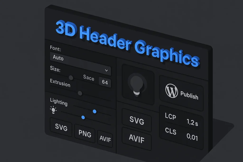
Strong blog headers do two jobs at once: they pull attention into the page and set expectations for everything that follows. A weak header gets skipped. An overworked one slows the page, hurts readability, and starts looking old fast. A 3d text generator is useful because it gives beginners a quicker path to polished, dimensional title graphics without dragging them through a full 3D workflow from scratch.
But speed is not the goal by itself. We see this mistake all the time in content teams: a tool makes something flashy in 30 seconds, and then that asset collapses under real publishing conditions. Mobile screens, WordPress crops, image compression, contrast rules, and Core Web Vitals are where header graphics either hold up or fail.
For beginners, the target is straightforward: build a headline graphic that stands out, reads in under a second, stays light enough for the web, and can be reused across multiple posts without redesigning everything. That is where a modern 3d text generator, paired with a disciplined template approach, becomes genuinely practical instead of gimmicky.
What Makes a Blog Header Graphic Eye-Catching
Eye-catching does not mean loud. In editorial design, attention usually comes from hierarchy, clarity, contrast, and just enough novelty to feel fresh. A header works when the viewer spots the main headline instantly, understands the tone, and feels that the design supports the topic instead of competing with it.
For 3D text headers, four elements usually decide whether the design lands well:
- Clear focal point: the title is visually dominant over background textures, icons, or decorative shapes.
- Readable dimensionality: depth, bevel, shadow, and highlights separate the text from the background instead of muddying it.
- Appropriate style: metallic, glass, plastic, soft gradient, matte, and cartoon finishes all signal different content types.
- Technical fit: the graphic stays sharp and loads fast across desktop and mobile layouts.
A common beginner mistake is treating detail as impact. On the ground, simpler headers often perform better because they communicate faster. We consider that one of the clearest dividing lines between amateur and professional header design: dimensional text should improve recognition, not slow it down. If the viewer has to decode the title, the effect is too heavy.
Scalability matters too. According to MDN documentation on SVG, SVG graphics can scale without loss of quality, which is one reason vector-based title treatments are attractive for header design. Crisp edges on both mobile and large desktop screens are not a luxury. They directly shape how professional the page feels.
Choosing the Right 3D Text Generator (web, AI, app)
Not every tool sold as a 3d text creator is actually good for blog headers. Some are built for novelty logos. Some are better for social stickers. Others focus on animation. A few are genuinely useful in a publishing workflow. Beginners should judge tools by output control, export options, and repeatability, not by how many shiny presets they advertise.
There are three broad categories of tools:
Web-based generators. These are the fastest route for non-designers. A 3d text generator online or free 3d text generator is often enough when the job is simple: create a title effect, export it, and place it into a blog header. The trade-off is obvious. You usually get less control over lighting, perspective, and export fidelity.
AI-assisted design tools. These can help generate backgrounds, textures, or style references around the text treatment. They are useful for quick concepting, but they often need cleanup if you care about typographic precision. If your workflow includes image support, resources on AI image generator tips for better blog visuals can help align imagery and typography.
Design apps with 3D controls. These give the best balance between precision and output quality. Adobe documents mainstream controls such as Extrude, Revolve, Inflate, Depth, Twist, Taper, and Cap in Illustrator’s 3D workflow, which shows that many effects expected from a 3d font generator or 3d text illustrator setup are now standard rather than niche features. For realistic surfaces and light behavior, Adobe also documents ray tracing support in Illustrator, making high-quality title rendering easier to access than it used to be.
When comparing tools, we suggest ignoring the marketing copy and checking these criteria instead:
| Evaluation area | What to look for | Why it matters for blog headers |
|---|---|---|
| Typography control | Font choice, letter spacing, line breaks, alignment | Prevents amateur-looking titles and supports hierarchy |
| 3D controls | Depth, bevel, perspective, material, shadow | Creates depth without destroying legibility |
| Export formats | SVG, PNG, AVIF, APNG, transparent background | Determines sharpness, file size, and WordPress flexibility |
| Template reuse | Saved presets, themes, brand styles | Reduces production time across multiple articles |
| Animation support | Short loops, export quality, fallback options | Important for hero motion without excessive payload |
The best tool is usually the one that gives you enough control to build a repeatable header system, not the one with the most dramatic preset gallery. On our side, that distinction matters more than brand name.
Plan Your Header: Message, Audience, and Visual Hierarchy
Before opening any 3d text maker, decide what the header actually needs to communicate. A design for a beginner tutorial is not the same as a design for an enterprise landing page or a gaming channel. The header should reflect the article’s promise, not just decorate its title.
Start with the message. If the article teaches a process, clarity should dominate. If it announces a product feature, the design can carry more polish and more brand cues. If it targets technical readers, decorative excess usually hurts credibility. We have seen B2B blogs lose trust simply because the visual style looked more like a YouTube thumbnail than an editorial asset.
Then define the audience. Beginners usually respond better to clean, high-contrast, clearly separated elements. Professional designers may tolerate more subtlety, but business readers almost always value readability first. This matters even more when a 3d letter generator output is being embedded into a B2B blog rather than a poster or thumbnail environment.
Visual hierarchy comes next. The headline should be first, the supporting phrase second, the brand cue third, and decoration last. If every element competes at the same intensity, the composition turns noisy. In practice, hierarchy is built through size, contrast, spacing, and where the detail is concentrated.
A simple planning model works well:
Primary layer: headline in 3D treatment. Secondary layer: one supporting phrase or icon cluster. Tertiary layer: background gradient, abstract forms, or subtle texture. That order keeps the text dominant even when the styling is bold.

Typography for 3D: Font, Weight, Spacing, Readability
Typography decides whether your 3D effect looks deliberate or amateur. Many beginners search for a 3d font maker or 3d font creator hoping the tool will solve the design automatically. It will not. The type choice still does most of the heavy lifting.
Heavy sans-serif fonts usually work best for dimensional headers because they give highlights, bevels, and shadows enough surface area to read clearly. Thin fonts tend to collapse under depth effects, especially on smaller screens. Decorative fonts can work for niche styles, but they lose versatility very quickly.
Weight matters because 3D treatments visually thin out the front face once shadows and sidewalls are added. A font that feels balanced in flat text can look fragile after extrusion. That is why medium or bold weight is often the practical minimum.
Spacing matters just as much. Tight tracking can make a 3D title feel cramped, especially when side depth adds extra dark mass between letters. Slightly increasing letter spacing often improves clarity. Line spacing needs a check too: stacked 3D lines can overlap visually if shadows are long or the perspective is aggressive.
For readability, test the header at three sizes:
Full desktop width, tablet width, and mobile crop. If the headline loses clarity on mobile, reduce the effect before changing the font. We would call this a classic overcorrection: many beginners swap typefaces when the real problem is too much bevel, too much shadow, or too little contrast.
For AI-assisted imagery around the title, articles about Google image generator for blog graphics can help build supporting visuals, but the text layer still needs human typographic judgment.
Color, Lighting, and Materials: From Flat to Dimensional
3D text becomes convincing when color and lighting describe form. Without them, depth feels pasted on. With too much of them, the title becomes hard to read. The goal is not realism for its own sake. The goal is visual separation that helps the headline do its job.
Color should start with contrast. W3C guidance states that text and images of text should meet a contrast ratio of at least 4.5:1 for regular text and 3:1 for large text, while non-text graphical objects should meet at least 3:1 against adjacent colors. So glossy bevels, metallic edges, and decorative accents still need to preserve separation from the background.
Materials set the emotional tone of the header:
Matte gradients feel editorial and modern. Metallic finishes feel bold and promotional. Glass or translucent styles feel contemporary but are harder to keep readable. Plastic cartoon materials work for casual or playful content but usually feel out of place in business publishing.
Lighting is what gives depth meaning. One dominant light source is usually enough. Once highlights start showing up from multiple directions, the form becomes inconsistent. Beginners often stack shine, glow, reflection, and shadow all at once. That nearly always weakens clarity.
If your tool supports more advanced rendering, Adobe’s 3D workflow documentation confirms that realistic lighting and shadow behavior are now normal in mainstream design applications, not just specialist 3D environments. That is good news. It also raises the bar for restraint. On our view, better tools do not justify heavier effects; they make subtle effects easier to execute well.
These thresholds are not abstract accessibility rules. They are practical design constraints that keep dramatic headers usable.
Depth Controls: Bevel, Extrusion, Perspective, Shadow
The most important technical controls in a 3d text gen workflow are also the easiest to overdo. Depth settings should describe form, not turn the title into a demo object.
Bevel shapes the edges of the front face. A soft bevel adds polish and catches light well. A hard bevel creates a more mechanical or metallic look. Too much bevel shrinks the usable flat surface of each letter and makes smaller text harder to read.
Extrusion defines the thickness of the letters. For blog headers, moderate depth usually works best because the text stays readable even when scaled down. Too much extrusion can overpower the front face and create awkward spacing between letters.
Perspective changes how dramatic the 3D angle feels. Mild perspective adds energy. Extreme perspective often makes part of the title unreadable, especially in longer phrases. For article headers, frontal or slightly tilted views are usually safer than dramatic distortion.
Shadow separates the text from the background. Soft shadows are versatile. Hard shadows can work in retro or comic-inspired styles. Long shadows create a strong directional look but add visual density very quickly.
The most stable beginner formula is:
- bold sans-serif font
- moderate extrusion
- light bevel
- single light source
- short or medium soft shadow
- high contrast front face against background
This combination gives dimension without sacrificing usability. It also adapts well whether you create 3d text free in a browser tool, use a 3d letter maker, or build the final version in a more advanced design app.
Static vs Animated 3D Text: When to Use Each
Animation gets attention, but it always comes with a cost: file weight, motion management, rendering complexity, and the risk of distracting from the article itself. Static 3D headers are usually the better default for blog posts because they load more predictably and stay sharper across devices.
Animated 3D text can still make sense in limited cases: campaign pages, feature launches, seasonal landing pages, or hero banners where motion communicates something relevant. A 3d animated text generator or 3d rotating text generator may be appropriate if the animation is short, subtle, and technically efficient.
Format choice becomes critical here. MDN’s image format guidance notes that APNG is a good choice for lossless animation and explicitly describes GIF as less performant. The same MDN resource also notes that AVIF is a strong choice for static and animated images, while recommending fallbacks because support history is newer than older formats. That matters because many people still default to a 3d text gif generator workflow even when GIF is the weakest option for smooth gradients and efficient delivery.
GIF is limited to 8 bits per pixel and up to 256 colors, which makes it a poor match for glossy 3D gradients and metallic surfaces. Banding and damaged highlights are common. PNG is much better than GIF for static text with alpha transparency, but it is often heavier than modern formats. If you need motion, use a modern format path where your stack allows it, and test the result in real publishing conditions.
For broader blog media planning, the discussion around when animated GIFs make sense in blog posts is useful context, but our position on 3D title graphics is conservative: animate only when motion adds meaning, not when it just adds movement.
For a quick format comparison, the table below shows the practical trade-offs for header graphics.
| Format | Best use | Main limitation |
|---|---|---|
| SVG | Sharp vector text and simple dimensional title treatments | Not ideal for photorealistic texture-heavy renders |
| PNG | Static 3D text with transparency and soft shadows | Larger file sizes than newer formats |
| AVIF | High-performance static or animated web delivery | Needs fallback planning in some workflows |
| APNG | Lossless short animation sequences | Can still become heavy if overused |
| GIF | Legacy support for simple motion | Poor color depth and weaker performance |
The right format is part of the design decision, not just an export setting at the end.
Step-by-Step: Create 3D Header Text with a Generator (Free Workflow)
Beginners usually get better results by following a fixed workflow than by clicking through every preset in a free online 3d animated text generator. The process below is built for practical publishing, not just for experimentation.
- Write the title for the layout, not just for SEO. If the headline is too long, shorten the on-image version while keeping the article H1 intact in the page content.
- Pick a bold, readable font. Start with a geometric or neo-grotesque sans-serif. Avoid novelty fonts until the composition works.
- Set the base colors first. Choose front-face color, side depth color, and background before adjusting 3D controls.
- Add moderate extrusion. Depth should be visible but not dominant. Reduce it if letter interiors start closing up.
- Apply a light bevel and one shadow direction. This creates dimensionality without clutter.
- Refine spacing. Check kerning, line breaks, and alignment. Many generated effects look better after manual spacing adjustments.
- Test on mobile width. Shrink the design to a narrow viewport preview and see whether the title still reads instantly.
- Export two or three versions. Try SVG if the effect stays simple enough, PNG for transparency-heavy static text, and AVIF for efficient final delivery where supported.
- Place inside the actual WordPress header area. Do not judge the design only inside the generator preview.
- Run a performance check. Measure the real page, not the isolated file.
This workflow works whether you make 3d text online, use a dedicated app, or combine generator output with manual cleanup in a design editor. It also works if your starting point is a 3d text creator or a lightweight 3d letter generator. The real advantage is consistency: each header is built against the same publishing criteria.
Export the Right Sizes and Formats for Web and WordPress
Export is where many good designs fall apart. Beginners often create a visually strong graphic and then publish an oversized raster image that slows the page and blurs on some devices. The output format has to match both the design complexity and the WordPress implementation method.
For simple vector-like title treatments, SVG deserves serious consideration. MDN notes that SVG is XML-based and text-editable, which makes simple title treatments easier to refine and localize than flattened raster graphics. That can be especially useful for multilingual blogs or template-driven content operations.
For static 3D headers with soft transparency, PNG remains reliable, especially if the design needs alpha transparency. A 3d text generator png export can be the right choice when you need clean edges and shadow detail. But file size can grow quickly. MDN’s image format guidance also states that lossy AVIF images are around 50% smaller than JPEGs at visually similar compression levels and that AVIF generally compresses better than WebP in median comparisons. In practical terms, that makes AVIF a strong candidate when you need visually rich headers without excessive payload.
The chart below summarizes the most useful web delivery logic for header graphics.
As a practical rule, use the lightest format that preserves the visual qualities the header actually needs. No heavier.
Within WordPress, also check how the theme crops featured or hero images. Some themes center-crop aggressively, which can cut off long 3D headlines. Build safe margins around the title and test the exact placement in the template, not only in the media library preview.

Accessibility, Performance, and Core Web Vitals for 3D Headers
Header graphics are often the largest visible element near the top of the page. That means they can affect user experience far more than many designers expect. Google’s PageSpeed Insights documentation explains that Core Web Vitals currently center on LCP, INP, and CLS, and that field experience is evaluated using the 75th percentile. In plain language, the header should be optimized for real visits on ordinary connections, not just for a clean local test.
web.dev also notes that the LCP resource is often an image or a web font. In practical terms, an oversized title image exported from a 3d text generator png workflow can directly delay the main loading milestone. The same web.dev guidance on LCP optimization reinforces a broader reality: images are often the heaviest resource on the web, so image weight is not separate from design quality. It is part of design quality.
The infographic below translates these concerns into a simple editorial priority model for header graphics.
For implementation, focus on five controls: compressed output, appropriate dimensions, lazy-loading decisions based on template context, strong contrast, and predictable layout boxes that prevent shifting.
If the header is the main hero image above the fold, lazy-loading may not always be appropriate because it can delay the primary visual. If it sits lower in the layout, lazy-loading can help. The decision depends on placement, not on a universal rule.
Accessibility also goes beyond contrast. Avoid embedding critical information exclusively inside stylized image text if the same message is not represented in the page heading structure. The visual header can reinforce the title, but the real H1 and surrounding semantic HTML still carry the main content meaning.
We have noticed that teams treating performance as a late-stage fix usually end up compromising the design more. Teams that plan for performance from the start tend to get cleaner visuals and better metrics at the same time.
When performance and readability are handled early, the final design usually gets better, not weaker.

Automate Consistency with Layout Themes and Style Templates (Autopilot SEO)
Most blog teams do not struggle with one header. They struggle with producing dozens of headers that look related, stay on-brand, and do not require a designer to rebuild the same structure every time. This is where styling templates and layout themes create more value than isolated design tricks.
A repeatable system might define one or two approved 3D text treatments, a set of header ratios, background rules, safe text zones, and export presets. That approach removes random variation while keeping enough flexibility for different article topics. It also reduces the risk that one article gets a polished header while the next one gets an oversized, inconsistent graphic built in a rush.
For content operations teams, this is the stronger model: create the design logic once, then reuse it. A generator becomes more useful when it works inside a template system rather than as a blank canvas every time. That applies whether the team uses a 3d font generator, a 3d text maker, or a more advanced app-based pipeline.
That is also where automated publishing workflows become relevant. Platforms such as SEO Autopilot are valuable not because they replace design judgment, but because they help standardize the broader content pipeline: structure, layout consistency, visual themes, and publication flow. For teams publishing at scale, custom layout themes can make blog design more effortless by reducing repetitive manual work and keeping article presentation aligned across the site.
In practice, the combination is efficient: use a controlled 3d text generator online workflow for the hero treatment, then apply repeatable layout rules so the final article looks like part of a coherent publishing system rather than a one-off asset. If you need to create 3d text online across many posts, consistency quickly becomes more valuable than novelty.

Common Mistakes to Avoid (Overeffects, Contrast, File Weight)
Most weak 3D headers fail for predictable reasons. The upside is that these problems are easy to spot once you know what to check.
Too many effects at once. Glow, bevel, reflection, multiple shadows, texture overlays, flares, and perspective distortion usually create noise. Use fewer controls and make each one clearer.
Poor headline hierarchy. If the background is as detailed as the title, attention gets split. The title should win instantly.
Low contrast. Stylish gradients do not rescue unreadable text. Contrast has to be verified, not assumed.
Wrong format. Exporting gradient-rich 3D text through a 3d text gif generator path creates avoidable quality loss. Exporting a simple vector-like title as a heavy bitmap wastes performance.
No mobile test. A header that works only at desktop width is not ready for production.
Ignoring theme crop behavior. Safe areas matter. Titles too close to the edges can be cut off in archive cards or social previews.
Starting from effects instead of message. The design should express the article idea. If the concept cannot be explained clearly, it is usually too decorative.
A disciplined workflow fixes most of these issues before they appear. On our experience, restraint is still the most underrated design skill in this whole category.
Implementation Checklist for Eye-Catching Header Graphics
A good header should pass both design review and publishing review. Before sending the graphic live, verify the following points.
| Checkpoint | Pass condition | Why it matters |
|---|---|---|
| Headline readability | Clear at mobile and desktop sizes | Protects comprehension and visual impact |
| Contrast | Foreground and decorative objects remain distinct | Supports accessibility and scan speed |
| File format | Matches design needs and delivery context | Improves sharpness and reduces payload |
| Theme fit | No unwanted crop in WordPress templates | Prevents broken presentation after publishing |
| Performance review | Page measured in real context, not only design preview | Protects LCP and overall page experience |
A header graphic is successful when it improves the page as a whole. That includes aesthetics, readability, and delivery efficiency at the same time.
The strongest beginner workflow is consistent: define the message, select typography, control depth, export for the web, test performance, and publish inside a repeatable layout system.
We believe that is the real takeaway here. A 3d text generator is not valuable because it makes text look fancy; it is valuable when it helps you produce readable, reusable, lightweight header assets at scale. The teams that win with these tools are usually the ones that combine design restraint with operational discipline.
Looking ahead, we expect more overlap between browser-based generators, AI-assisted styling, and production-ready export pipelines. That will make it easier to create 3d text online or even create 3d text free with better quality than a few years ago. But the core standard will not change: if the header is slow, noisy, or hard to read, better software will not save it.
FAQ
What is the best free 3D text generator for blog headers?
The best free option is the one that gives clean typography control, moderate 3D settings, and practical export formats. For blog work, a free 3d text generator should be judged on readability, transparency support, and file efficiency rather than on flashy presets alone.
If the tool cannot produce sharp output, manageable file sizes, or reusable styles, it will create more publishing work later.
How do I make 3D text online without Photoshop?
Use a web-based 3d text generator online or a browser design tool with text effects, then refine spacing, contrast, and export settings before publishing. The simplest workflow is to choose a bold font, add moderate extrusion, use one light source, and export in a web-appropriate format.
You can also create 3d text online and combine it with a separate background in WordPress or a layout editor if the generator itself has limited composition controls. If needed, you can also make 3d text online first and polish it in another tool.
What size and format should a blog header image be in WordPress?
The correct size depends on your theme’s hero and featured image areas, but the image should be large enough for desktop while remaining optimized for mobile delivery. For format, SVG works well for simple vector-like text treatments, PNG is reliable for transparency-heavy static graphics, and AVIF is often the most efficient choice for richer visuals when supported in your stack.
Always test the real theme crop and run performance checks on the live page template, not just on the image file alone.
Should I use animated 3D text in hero images for SEO?
Usually only when the animation adds genuine communication value and remains technically light. A 3d animated text generator can help for launches or campaign pages, but static headers are safer for speed, readability, and consistent UX.
If you animate, avoid defaulting to GIF for gradient-heavy 3D styles. A 3d rotating text generator or even a free online 3d animated text generator can be useful, but only if the motion does not become the page’s performance bottleneck.
How do I keep 3D header graphics fast-loading on mobile?
Reduce file weight, choose the right format, limit unnecessary texture detail, and test the actual page in performance tools. Since the header can become the LCP asset, a 3d text generator workflow should include export comparison, dimension control, and mobile validation before publication.
Fast-loading mobile headers are usually the result of simpler effects, better compression, and stronger layout discipline rather than of any single tool feature. If you are using a 3d text generator png export, compare it against lighter alternatives before publishing.