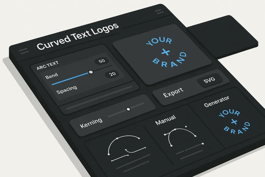
Logo layouts fall apart faster on curves than on straight baselines. A curved text generator can produce a usable arc or circle in seconds, but the result looks professional only when someone controls shape, spacing, alignment, and export format with intent. On our view, that is the real line between a quick mockup and a brand asset that can survive web, print, social, and small-screen use.
Curved text looks easy because the pattern is familiar: wrap a name around a badge, place a wordmark over an icon, or fit type inside a circular space. In practice, curved logos are unforgiving. Uneven kerning, weak baseline placement, over-tight letter spacing, and poor icon balance show up immediately. That is why teams often start with a curved text generator online free option for speed, then refine the layout with a more deliberate review process.
The good news: modern tools have lowered the barrier a lot. Canva describes curved, bent, spiral, and circular text options for logos, labels, stickers, and social graphics in its curved text feature overview. At the same time, Adobe Illustrator still sets the standard for manual path control because its Type on a Path workflow lets designers move, flip, align, and space text with much more precision, as documented in the official Illustrator Type on a Path guide.
That contrast matters when you choose between an arched text generator, a circle text generator, or full vector editing. Speed matters. Precision matters too. We have seen the strongest curved logos come from using both at the right stage.
What Is a Curved Text Logo and When to Use It
A curved text logo places text along an arc, circle, wave, spiral, or custom path instead of a straight horizontal line. The curve can be subtle, like a slight upward arch over an icon, or structural, like a circular wordmark that forms a full badge around a symbol.
These layouts work best when the brand system needs one or more of the following:
- compact logo construction for avatars, profile images, and social thumbnails
- badge-style branding for packaging, labels, seals, stickers, and merch
- visual framing around an icon, monogram, or mascot
- retro, athletic, craft, institutional, or emblem-based identity systems
- space-efficient lockups where straight text would feel too wide
Canva explicitly positions curved text for profile photo overlays, stickers, badges, logos, and print-ready graphics, which matches these practical use cases. The point is not decoration. Curved text solves a layout problem: how to make typography occupy a shape-driven space without wasting area or forcing the icon to become too small.
A curved text logo is not automatically better than a horizontal wordmark. It is better when the shape improves recognition, fit, or hierarchy. If a brand name is long, highly technical, or hard to read at small sizes, forcing it into a circle usually hurts clarity. If the name is short and the icon-centered composition matters, a circular text logo maker can produce a much stronger lockup. On our practice, this is where many teams make the first expensive mistake: they choose the shape before they test readability.
From a workflow perspective, teams use different tools at different stages:
Early concept stage: quick generator-based exploration, often with a free curved text generator or a simple curve text creator.
Brand refinement stage: baseline, kerning, spacing, and geometry adjustments in vector software.
Production stage: export into SVG, PNG, and additional variants for dark backgrounds, favicons, profile circles, print, and responsive website contexts.
That sequence is efficient because the first decision is composition, not perfection. Curves are easy to test quickly and expensive to perfect manually if the underlying concept is weak. We consider that a healthy workflow, not a compromise.
Manual vs Generator: Which Method to Curve Text Faster
The simplest answer is this: a generator wins the first draft, while manual vector editing wins the last mile.
A curved text generator is built for immediate output. You enter text, choose an arc or circle, adjust curvature, and export a draft. A manual tool such as Illustrator requires path creation, text-on-path setup, baseline review, spacing adjustment, and often more than one refinement pass. That route is slower, but it offers control a lightweight curved text maker usually cannot match.
Adobe’s documentation makes the difference clear. Illustrator allows text on any path or shape outline, movement along the path, flipping, alignment to Ascender, Descender, Center, or Baseline, spacing changes, and path text effects including Rainbow, Skew, 3D Ribbon, Stair Step, and Gravity. That depth is why advanced logo designers still rely on manual vector software for final assets.
Cost also shapes the decision. Adobe lists Illustrator as a subscription product, with the annual prepaid individual plan shown at US$263.88 per year on Adobe’s pricing page. Generator tools are often lower-friction for teams that need quick output, cross-device editing, or low-cost experimentation.
| Criteria | Curved Text Generator | Manual Vector Workflow |
|---|---|---|
| Speed to first mockup | Very fast; suitable for rapid concepting | Slower; setup and refinement take longer |
| Baseline and path control | Usually limited to basic curvature controls | High control over alignment, flipping, offset, and path position |
| Spacing refinement | Basic in many tools | Detailed kerning and character spacing control |
| Cross-device convenience | Strong; many tools support browser and mobile editing | Primarily desktop-centered |
| Best use case | Fast logo mockups, social assets, early testing | Final brand assets, scalable identity systems |
The practical takeaway is straightforward: use a curved text generator online free tool when the business decision is still about direction, then move to manual refinement if the logo becomes a long-term identity asset.
The market split is really a workflow tradeoff. Generators reduce setup friction. Manual editing increases control depth. On our view, teams waste time when they treat this as an either-or debate.
For production teams, the decision is not generator versus Illustrator as an ideology. It is about which stage of the asset lifecycle you are in.
There is also a middle ground. Many teams start with a curved text logo maker, approve direction internally, and then rebuild the chosen concept as vectors for precision. That hybrid approach is often the most efficient because it avoids spending manual effort on concepts that never pass review.
Step-by-Step: Design a Curved Text Logo with a Generator
A generator-based workflow works best when it follows a structure. Without one, people tend to over-focus on effects and under-focus on geometry.
- Define the logo format first. Decide whether the mark is a top arc, bottom arc, full circle, split circle, or icon-centered badge. This sets the shape before the text is even entered.
- Choose a short, stable text string. Curved layouts punish long names. If the brand name is lengthy, test an abbreviation, category text, or a two-ring construction.
- Select the base tool. Use a circle text generator or arched text generator if the structure is simple. Use a more flexible editor if you expect multiple revisions.
- Apply curvature conservatively. Most weak logo drafts fail because the arc is too aggressive. Start with a moderate curve and increase it only if the shape still feels flat.
- Adjust text size before spacing. Scale determines how much path length is available. Kerning fixes made at the wrong size usually collapse after resizing.
- Refine spacing and alignment. Look for visual gaps around letters like A, V, T, Y, O, and R. Curves exaggerate inconsistent spacing.
- Add the icon or central element. The icon should not compete with the text arc. In most badge systems, one element dominates and the other frames.
- Test small-size readability. Reduce the logo to favicon, avatar, and mobile-header dimensions. If the curved type collapses, simplify.
- Export vector first, raster second. A scalable master file protects future use cases.
This process works whether the tool is a curved font generator, a round text generator, or a more feature-rich editor. The principle stays the same: shape first, typography second, polish third.
One common mistake in generator tools is using effects too early. Teams see options like wave, spiral, or exaggerated bend and assume visual novelty equals stronger branding. In reality, logo performance depends far more on legibility, contour harmony, and spacing discipline than on the degree of curvature. We think this is one of the clearest differences between playful output and usable identity work.
When you create curved text online, keep the first version plain. Decorative styling such as shadows, gradients, embossing, and distortions should come only after the black-and-white version already works.

If the chosen tool supports duplication, duplicate variants aggressively. Test one version with tighter spacing, one with lighter spacing, one with a lower arc, and one with a slightly smaller icon. Review them at 100%, 50%, and thumbnail size. The best option is rarely the most dramatic one.
For teams building broader visual assets, the same draft can later support header graphics, mock social posts, or launch visuals. That is where related workflows such as how to design header graphics with a 3D text generator become relevant if the identity needs display variants beyond the logo itself.
Pick the Right Shape: Circle, Arch, Wave, Spiral
Different curve shapes solve different design problems. Pick the wrong one, and even a good typeface will look amateur.
Circle: Best for seals, badges, stamps, communities, clubs, coffee brands, event logos, and icon-centered social avatars. A circular text logo maker is the usual starting tool here. Circles create enclosure and can make a simple icon feel more substantial.
Arch: Best for sports-style marks, retro layouts, emblems, and brands that need a top-heavy framing line over a symbol. The curve word generator approach is usually strongest in this format because the word stays mostly readable.
Wave: Best for creative, informal, or motion-oriented visuals, but less reliable for core logos. Waves are more expressive than stable.
Spiral: Useful for posters, campaigns, and eye-catching social graphics, but usually too complex for a primary brand mark. Canva mentions spiral layouts among its curved text options, which is useful for experimentation but rarely ideal for a foundational identity system.
The shape choice should align with both reading direction and symbol geometry. If the icon is circular, a circle or arch often feels integrated. If the icon is tall and vertical, a wide arch can support it better than a full ring. If the text has many ascenders and descenders, an aggressive lower curve may make letterforms feel unstable.
When the goal is speed, a bend text generator can help test these shapes quickly. When the goal is consistency across a brand system, choose the shape that scales cleanly into favicon, packaging, website header, and social profile use. We have noticed that brands almost always end up simplifying here, not adding complexity.
Typography on a Curve: Fonts, Kerning, Spacing, Baseline
Typography is where most curved logos succeed or fail. A curved text generator can create the path, but it cannot guarantee optical balance on its own. Even when the font is strong, the layout can still fail on spacing.
Adobe’s Type on a Path options show why professional tools still matter here. Text can be aligned to Ascender, Descender, Center, or Baseline. That alignment control matters because the same word can appear elegant or awkward depending on where its letterforms sit relative to the curve.
Baseline decisions affect emotional tone:
Baseline-centered curves tend to feel stable and neutral.
Ascender- or descender-driven placement can feel tighter or more stylized but may introduce uneven visual pressure.
Outer circle placement often increases badge clarity.
Inner circle placement can save space but usually reduces readability.
Kerning on a curve matters even more than on a straight baseline because the eye reads changing angles and spacing at the same time. Gaps that are barely noticeable in flat text become obvious once the text bends around a shape. Letters with diagonal structures and open counters usually need extra review.
When you create curved text in Illustrator, character spacing is adjustable, which gives you direct control over this problem. In simple generator tools, spacing may be more limited, so the font choice becomes more critical. Fonts with even proportions and moderate width usually curve more gracefully than condensed, highly decorative, or ultra-bold faces.
As a rule:
- Use simple sans-serif or sturdy serif fonts first.
- Avoid very narrow fonts for tight circles.
- Avoid scripts unless the logo is large-format and readability is not fragile.
- Reduce tracking slightly only after confirming the mark still breathes at small sizes.
- Watch letters near the visual top and bottom of the circle; they often appear farther apart than they really are.
This is also where manual workflows outperform a basic curve text generator free option. Illustrator exposes not just spacing but effect-level variation. Adobe lists Rainbow, Skew, 3D Ribbon, Stair Step, and Gravity among the path text effects. Most logo projects should stay close to neutral effects, but those options show how broad manual control can become when a brand system needs something custom.
| Typography Variable | What It Changes | Typical Risk if Ignored |
|---|---|---|
| Kerning | Controls space between specific letter pairs | Uneven visual gaps become obvious on arcs |
| Tracking | Changes overall letter spacing | Text looks cramped or too loose around the path |
| Baseline alignment | Determines how letters sit on the curve | Logo feels off-center or mechanically awkward |
| Font width and weight | Affects readability and arc density | Letters clog tight curves or feel weak at small size |
In curved logos, font choice matters. Spacing discipline usually matters more. That is our position after seeing too many otherwise decent marks fail on simple kerning issues.
If you create curved text in Canva, use the tool for rapid testing, but assume that final polish may still require manual intervention if the logo becomes a core brand asset.
Visual Balance: Pairing Icons and Curved Type in a Lockup
Curved text rarely stands alone in production branding. It usually interacts with an icon, monogram, badge outline, symbol, or secondary descriptor. The lockup has to feel balanced, not crowded.
There are three common structures:
Top arc plus central icon: effective when the brand name is primary and the symbol supports it.
Full circular text plus icon inside: strongest for seals, communities, packaging marks, and profile avatars.
Split circular text: brand name on top, category or location on bottom. This works well when a short central icon needs formal framing.
The icon should not be scaled until the type arc has been stabilized. Many weak badge logos come from designing the symbol first and then squeezing text around it. Reverse the order: define the text radius and visual weight, then fit the symbol proportionally.
Good lockup balance depends on four relationships:
Distance: enough space between icon and text to avoid collision.
Weight: the icon and text should feel similar in visual density.
Dominance: one element should lead; if both try to lead, the mark becomes noisy.
Symmetry: badge structures need a clear center, even if the forms are not mathematically identical.
When reviewing a curved text logo maker output, temporarily remove color and effects. If the icon and arc look balanced in black and white, the lockup is structurally sound. If they only look good after gradients or shadows, the geometry is probably weak. On our view, this single test exposes more bad logo decisions than most design presentations do.
For adjacent design systems such as blog covers or social thumbnails, related asset creation workflows like using Bing Image Creator for blog covers can help extend the same visual direction into content graphics without rebuilding the identity from scratch.
Export Correctly: SVG, PNG, Sizes, and Color Variants
Export choices determine whether a curved logo stays flexible after approval. This is where many otherwise solid drafts lose long-term value.
SVG should be the default master format whenever possible. The W3C SVG specification has long supported text on a path through the textPath element, and the standard treats text on a path as a core capability rather than a vendor-specific workaround, as shown in the SVG 1.1 text specification from W3C. MDN further documents that textPath supports controls such as startOffset, side, spacing, method, textLength, and href, which are directly relevant when centering or reusing curved logo structures in code, according to the MDN reference for SVG textPath.
That matters because vector export keeps the text scalable. A raster export flattens the result into pixels. For logos, that is often acceptable for social uploads or quick sharing, but it is not ideal as the only master asset.
Browser support is also strong enough for practical web use. Can I Use reports 96.7% global support for SVG textPath as of March 5, 2026, across major modern browsers and mainstream mobile environments. That makes SVG a realistic default for web-facing brand assets when implementation is handled correctly.
Export logic should look like this:
SVG: master vector for websites, app interfaces, and scalable brand usage.
PNG: fallback or platform-specific upload asset, especially where transparency is needed.
Large PNG or PDF: practical for print previews, stakeholder review, or systems that do not preserve SVG behavior.
Prepare color variants as separate exports:
Full color for standard use.
One-color dark for light backgrounds.
One-color light for dark backgrounds.
Small-size simplified version if the full curved text construction becomes unreadable.
| Export Format | Best For | Main Limitation |
|---|---|---|
| SVG | Web, scalable UI, brand masters, code-ready assets | Some platforms convert or simplify uploads |
| PNG | Social platforms, quick sharing, transparent raster use | Not infinitely scalable; quality tied to dimensions |
| PDF or print-ready vector | Vendor proofs, print review, packaging workflows | Less convenient for web deployment |
A clean export stack is part of logo quality, not a finishing detail. We would go further: poor export discipline can ruin a good design faster than mediocre typography.
Web and Print Readiness: Readability, Accessibility, and Performance
A curved logo may look balanced on a large artboard and still fail in live environments. Web and print readiness require separate checks.
For web use, curved text should remain readable in header navigation, site footers, profile icons, Open Graph previews, and mobile browser tabs if adapted for those placements. Circular logos often need a simplified version for very small display sizes. If the brand name becomes a gray ring at 24 to 32 pixels, the problem is not export quality. It is structural complexity.
For accessibility and practical legibility:
Maintain contrast. Curved logos with thin strokes on textured backgrounds collapse quickly.
Avoid over-fine detail. Inner circles, secondary taglines, and decorative dividers often become noise.
Use alternate lockups. A straight-text fallback is often useful for narrow header placements.
Test dark and light modes. Web interfaces increasingly require both.
For performance, SVG is usually efficient for logos because it scales without requiring multiple raster versions. That advantage is strongest when the SVG remains clean and is not overloaded with unnecessary complexity.
For print, inspect stroke thickness, negative space, and minimum reproduction size. A badge that looks crisp on screen can clog on packaging, embroidery, or stickers if counters are too tight or letter spacing is too compressed.
Generator-based design helps with speed here too. Teams can add curved text to photo mockups, print overlays, and social previews early in the process to see whether the identity survives real contexts before formal approval. On our practice, that early context testing catches more issues than endless artboard tweaking.
In practice, avatar and compact profile use often impose the strictest constraints because circular marks are frequently displayed at tiny dimensions.
Quality Checklist and Common Mistakes to Avoid
A curved logo draft is ready for approval only after it passes a basic quality checklist.
Check shape logic. Does the chosen arc or circle solve a layout need, or is it only decorative?
Check spacing. Are any letter pairs noticeably open or cramped?
Check icon relationship. Is the symbol competing with the text, or supporting it?
Check small-size behavior. Can the mark survive reduced dimensions?
Check export stack. Is there an SVG master and at least one transparent PNG version?
Check variant logic. Do light, dark, and simplified versions exist?
Check context fit. Does the logo work in website headers, profile circles, packaging, and social posts?
The most common mistakes are consistent across tools:
Over-curving the text. The more extreme the bend, the more fragile the readability.
Using fonts that are too narrow or too ornate. Curves intensify complexity.
Forgetting optical centering. Mathematical center and visual center are not always the same.
Adding too many effects. A logo is not a poster.
Exporting only raster files. That limits future usability.
Assuming generator output is final by default. Generators are efficient, but not infallible.
Design teams that also produce content visuals can apply similar review discipline to adjacent assets. For example, tips for getting better blog visuals from an AI image generator are useful when the logo must coexist with broader campaign imagery and branded thumbnails.
Our short take: if the logo needs effects to look finished, it probably is not finished. Good curved marks hold up even when stripped to basics.
Troubleshooting: Jagged Edges, Off-Center Arcs, Spacing Issues
Most troubleshooting falls into three categories: rendering, geometry, and typography.
Jagged edges: This usually results from exporting too small a PNG, using raster when vector was needed, or scaling a low-resolution asset. Fix it by returning to SVG or increasing raster export dimensions significantly.
Off-center arcs: The text may be mathematically centered on the path but still look visually shifted because letter shapes are uneven. Adjust start position and optical alignment manually. If the tool supports path offset or start controls, use them. MDN notes that textPath supports startOffset, which is directly relevant in code-based or SVG-level correction.
Spacing issues: If one side of the arc feels heavy, inspect letter pairs near the top center and near transitions into steep curve angles. Reduce decorative effects and focus on tracking and pair kerning first.
Crowded icon center: Either shrink the icon, enlarge the radius, or reduce text weight. Do not solve this by tightening spacing alone.
Unreadable small version: Create a simplified alternate mark. In many cases, the right fix is not micro-optimization but a separate small-scale logo version.
Generator limitations: If the tool cannot deliver proper baseline, spacing, or export control, stop forcing it. Rebuild the approved concept manually.
There is also a technical misconception worth clearing up: some users search for a curved text generator copy and paste as if curved logo text can always be transferred cleanly between platforms as plain characters. In real branding workflows, curve behavior is usually tied to layout instructions, SVG path logic, or editor-specific effects. Copy-paste can preserve text content, but not always the curved construction itself.
We would treat that as a useful warning sign. If portability matters, test the workflow early rather than after approval.
Templates and Use Cases for Brands and Social
Templates are useful when they speed up testing without locking the team into generic output. That is the right role for an arched text generator, circle text generator, or curved text logo maker.
Good template-driven use cases include:
Social profile marks: circular text around a monogram or icon.
Podcast or community branding: seal-like construction that reads clearly in app libraries.
Product badges: small circular marks for packaging, labels, and sticker systems.
Campaign visuals: temporary curved headlines around product photography or launch artwork.
Content branding: graphic overlays for blog headers, thumbnails, or series covers.
In these scenarios, speed matters because the goal is often variation volume. A free curved text generator can help teams generate multiple options quickly, compare layouts, and shortlist viable directions before deeper design work begins. In some cases, a 3d curved text generator can also support display-style campaign graphics, though we would be careful about using that look for a core logo.
For content teams that already experiment with image generation, adjacent resources such as exploring Google image generator workflows for blog graphics can complement template-led branding systems when the same visual language needs to appear in ongoing publishing.
The key is to treat templates as scaffolding, not as the brand itself. A useful template reduces time to concept. A strong identity still depends on deliberate refinement. We think that distinction matters more now because tool access is easy and visual sameness is everywhere.
Next Steps: Automate Revisions and Asset Handoff
Once the logo direction is approved, the next efficiency gain comes from process automation. That includes naming conventions, export packaging, variant delivery, and content-system handoff.
A practical handoff package for a curved logo should include:
Master vector: SVG or editable source.
Transparent PNG files: standard and high-resolution versions.
Color variants: light, dark, and one-color.
Small-use variant: simplified profile or favicon option.
Usage notes: minimum size, safe area, and prohibited distortions.
Automation is especially valuable when the logo is only one asset in a larger content operation. Marketing teams that manage blog covers, category thumbnails, social graphics, and recurring campaign visuals benefit from repeatable generation and publishing workflows rather than isolated manual file handling.
That is where tools built for scale become relevant. For teams that need to move from one-off design tasks into systematic content production, SEO Autopilot helps automate the content pipeline from topic planning and semantic structure to article generation, image workflow support, and WordPress publishing. It is not a logo design tool, but it fits the same operational logic: replace repetitive production friction with a controlled system that speeds delivery without removing editorial oversight.
For B2B teams, agencies, and site owners, that combination matters. Design automation accelerates asset creation. Content automation accelerates publishing. The operational advantage appears when both are treated as structured workflows instead of isolated tasks.
On our view, the real lesson is simple: a curved logo works when geometry, typography, and export discipline work together. The fastest tool is not always the best one, but the right curved text generator can remove a lot of early friction and help teams get to a viable direction faster. What matters most is knowing when to stop generating and start refining.
Looking ahead, we expect more browser-based tools to close part of the gap with desktop vector software, especially for spacing controls, SVG export, and collaborative revisions. But we do not expect judgment to be automated away. Brands will still need someone to decide what is readable, scalable, and worth keeping.
FAQ
How do I make a curved text logo without Illustrator?
Use a curved text generator or a browser-based editor that supports arc, circle, or bend controls. Start with a simple shape, refine spacing, test readability at small sizes, and export SVG if available for a scalable master.
What’s the best font for circular or arched logos?
Simple sans-serif and sturdy serif fonts are usually the safest starting point. The best font is the one that stays readable on a curve and does not create awkward gaps, especially in tight circular layouts.
Should I export a curved text logo as SVG or PNG?
SVG should usually be the master format because it stays vector-based and scales cleanly. PNG is useful for platform uploads, previews, and transparent raster needs, but it should not be the only version you keep.
How do I center curved text perfectly around a circle?
Centering requires both mathematical placement and optical adjustment. Use path offset or start controls where available, then inspect whether the word still looks visually centered after accounting for uneven letter shapes and spacing.
Will a curved text logo stay readable on small screens?
Only if the layout is simple enough. Tight circles, thin fonts, long names, and small inner details often collapse on mobile or avatar sizes, so a simplified small-scale variant is often necessary.