
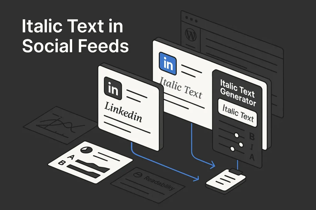
Attention in social feeds is won at the scan level before it is won at the idea level. An italicized text generator matters because most posts are judged in under a second: headline shape, line breaks, emphasis, and visual contrast decide whether a user stops or keeps scrolling. On LinkedIn and Facebook, that makes formatting a distribution tactic, not a cosmetic extra.
We see the same mistake again and again: marketers obsess over wording and barely think about presentation. The result is predictable. Strong ideas get buried inside flat text blocks and disappear between creator posts, news links, screenshots, and promo updates. A restrained mix of Unicode italics, bold-italic accents, short subheads, and cleaner structure can improve scannability without turning the post into noise. On our reading, that is the real job of an italicized text generator: not to decorate everything, but to create contrast exactly where the eye needs it.
Platform context explains why this plays out differently by channel. According to Pew data on Facebook and social platform usage, 68% of U.S. adults use Facebook, 47% use Instagram, and 30% use LinkedIn. Facebook also operates at roughly 3 billion monthly users globally, which means small gains in readability can affect very large audiences. Feed competition is not limited to brands either: the same Pew data notes that 30% of U.S. adults regularly get news from Facebook, so branded posts compete directly with news content, creators, communities, and personal updates.
For growth teams, the takeaway is simple: formatting will not replace positioning, but it can multiply visibility. If the first two lines are weakly structured, the best argument below them often goes unseen.

Why formatting wins attention in crowded social feeds
Feed environments reward compression. Users do not read linearly; they skim for entry points. Those entry points are usually one of four things: a strong first line, a short visual break, a highlighted phrase, or a familiar structural pattern such as a list or mini-framework. Formatting creates those entry points faster than wording alone.
That is why an italicized generator or italicized font generator keeps attracting search demand even though the task itself seems simple. People are not just asking how to style text. They want a lightweight way to improve feed performance when native formatting controls are limited or inconsistent.
On LinkedIn, where professional content competes inside text-dense feeds, a single italic or bold-italic hook can separate a post from generic commentary. On Facebook, where the audience is broader and the surrounding content mix is messier, formatting has to serve readability first. The same styling choice can look sharp on LinkedIn and excessive on Facebook. We consider that distinction one of the easiest things teams miss.
The practical value of formatting becomes clearer when comparing feed conditions by platform.
| Platform factor | Formatting implication | ||
|---|---|---|---|
| Audience context | Professional, expertise-led | Broader consumer and community mix | LinkedIn tolerates restrained emphasis; Facebook rewards clarity |
| Text competition | Long-form opinions, carousels, founder posts | News, memes, groups, events, links, personal updates | Hooks must be scan-friendly in both, but Facebook needs simpler patterns |
| Native formatting support | Limited in public posts | Limited and inconsistent by context | Copy-paste Unicode becomes the workaround |
| Best use of stylized text | Hooks, subheads, carousel captions, profile accents | CTA fragments, list labels, event callouts | Short emphasized units outperform full stylized paragraphs |
The strongest formatting usually looks almost invisible. It creates hierarchy without making the post feel manipulated. On our experience, that is the sweet spot.
A simple market reality supports this disciplined approach. According to the Pew social media report, LinkedIn usage among Americans is much higher among people with at least a bachelor’s degree than among users with lower formal education levels. That concentration means the platform often rewards professional tone, credibility cues, and structured writing more than novelty alone.
Platform size alone does not guarantee response, but it does raise the cost of mediocre presentation. In crowded feeds, formatting earns the right to be read.

Where italic Unicode actually works on LinkedIn and Facebook
The most important technical distinction is this: most public social posts are not using true rich-text italics. They are using Unicode characters that look italicized. That is the basis of nearly every italicized word generator, fancy italic text generator, or english to italic font tool.
Unicode includes separate character sets for styled forms. The Unicode chart for Mathematical Alphanumeric Symbols shows italic, bold, sans-serif italic, and bold-italic letterforms. This is why one tool may output a slightly different visual result from another even when both promise “italic” text. The appearance depends on which Unicode code points the generator uses.
That also explains why terms such as italicized copy paste, italicized copy and paste, and bold italic text generator copy and paste appear so often in search behavior. Users are not toggling formatting inside the platform. They are generating a Unicode version elsewhere and pasting it into the post composer.
Compatibility is context-specific:
- LinkedIn public posts: usually display Unicode stylized letters, which makes LinkedIn one of the most common places for restrained stylized hooks.
- LinkedIn headlines and profile sections: some stylized characters display correctly, but overuse can make a profile look gimmicky or impair parsing.
- Facebook posts and comments: stylized Unicode can display, but rendering consistency should be checked on mobile and desktop.
- Facebook chat contexts: Facebook officially supports bold, italic, strikethrough, monospace, and code formatting in some desktop chat scenarios, but Facebook Help notes this formatting is not shown in the Messenger mobile app.
The operational takeaway is simple. A copy-paste style approach is useful for public feed content, but it is not the same as true rich-text support. That difference matters for accessibility, search, indexing, and consistency. We have seen teams treat these as equivalent and run into avoidable QA issues later.
Unicode normalization adds another layer. As described in Unicode Technical Report 25, many mathematical alphabetic symbols have compatibility relationships with base Latin letters. In plain terms, some systems normalize stylized forms back to standard text while others preserve the stylized appearance. That is why the same post can look consistent in one view and behave differently in another downstream workflow.
If you are evaluating an italicized font generator, check four things before using it operationally:
- Does the output display correctly on desktop and mobile?
- Does the stylized text remain readable inside a longer paragraph?
- Does copy-paste preserve line breaks and spacing?
- Does the brand actually benefit from the styling, or is it visual clutter?
The answer is often yes for hooks and short labels, and no for long-form body copy.

When to use italics vs bold, caps, and emojis
Formatting is a hierarchy problem. Different emphasis types do different jobs. The mistake is treating every style as interchangeable.
Italics are best for nuance, contrast, or a soft shift in tone. They work well for a phrase that reframes the main point, a subhead inside a post, or a short CTA fragment that should feel lighter than a hard sell.
Bold-italic is stronger and should be used sparingly. It is effective for one phrase in the hook, one label in a list, or one line under a visual asset. This is where an italic bold font generator can be useful, especially when a normal italic is too subtle against a noisy feed.
All caps create urgency and separation, but they can easily read as shouting. They are suitable for brief labels such as UPDATE, NEW, or CASE STUDY when the surrounding text is clean.
Emojis are directional markers more than text styles. They can add scan points, but they do not replace hierarchy. On LinkedIn especially, too many emojis often damage perceived credibility faster than a restrained stylized phrase. We think this is one of the clearest differences between creator-style posting and brand-safe posting.
A practical framework looks like this:
| Style | Best use | Main risk |
|---|---|---|
| Italic | Short emphasis, contrast phrase, subhead | Becomes hard to read in long blocks |
| Bold-italic | Primary hook accent, CTA fragment | Looks promotional if repeated |
| ALL CAPS | Labels, announcements, short separators | Feels aggressive or noisy |
| Emoji | Bullet replacement, directional cue | Can cheapen professional tone |
The strongest posts usually combine only one or two of these methods. If everything is emphasized, nothing is emphasized.
For teams asking whether a cursive italic font generator or heavily decorative variant helps, our answer is usually no for serious distribution. Decorative text may fit a creator aesthetic or a casual profile accent, but for B2B feeds it reduces clarity. A cleaner italic font style name output, closer to standard serif or sans-serif italic letterforms, is typically safer.
How to generate italics: copy-and-paste workflow (desktop and mobile)
The most reliable workflow is still the simplest one: write in plain text first, generate only the words that need emphasis, test the result in context, and then paste into the platform. This is how most people use an italicized text copy paste workflow in practice.
On desktop, the process should be operationalized instead of improvised:
- Draft the post in normal text.
- Identify only one to three emphasis targets: usually the hook, one subhead, or one CTA phrase.
- Paste those fragments into an italicized generator or italicized text generator.
- Choose the lightest variant that remains visually distinct.
- Paste the stylized fragment back into the draft.
- Preview on both desktop and mobile before publishing.
This matters because stylized copy is rarely the main performance lever. The structure around it still determines whether people read. If the hook is vague, no amount of Unicode styling will rescue it. We have tested this enough times to be blunt about it.
A disciplined workflow also avoids the most common mistake: converting an entire paragraph. Long stylized paragraphs are harder to read, harder to process, and more likely to create rendering issues. Treat the generator as a micro-formatting tool, not a full-text transformation engine.
Writers who are already optimizing readability may benefit from adjacent practices such as shortening sentence length and reducing clause stacking. The same principle appears in our guide on how to rephrase sentences for better readability with an AI rephraser, where structure improves comprehension before design does.

Mobile tips: Android and iOS options for italic text
Mobile is where friction usually increases. Users often search for how to italicize text on android or how to type in italics on phone keyboard expecting a native keyboard toggle. In most cases, standard mobile keyboards do not provide universal italic styling for social post text. The workable method is still external generation plus copy and paste.
For Android, the practical path is straightforward:
- Open a browser-based generator.
- Type or paste the phrase you want to style.
- Copy the italic or bold-italic result.
- Paste it into LinkedIn or Facebook.
- Check the preview before publishing.
The same applies on iPhone. There is no platform-wide iOS social posting shortcut that turns standard feed text into true italics across apps. A browser-based italicized copy and paste workflow remains more reliable than hunting for device-specific keyboard hacks.
There are two additional mobile considerations.
First, rendering consistency. A phrase that looks elegant on desktop may look cramped on a smaller screen. This affects especially dense variants from a fancy italic text generator. If you also need numbers in italic font for dates, prices, or list labels, test those carefully too, because numerals can look less balanced than letters in some Unicode sets.
Second, editing friction. Once pasted, stylized Unicode can be annoying to revise mid-draft, especially if multiple fragments are involved. That is another reason to keep the stylized portion short.
If a team manages social posts at scale, mobile should be used for review and emergency edits, not for core drafting. Generate and QA stylized text at the desktop stage, then validate on mobile before final approval. On our view, this small workflow rule prevents a lot of avoidable mess.
Mobile compatibility is not a reason to avoid stylized text entirely. It is a reason to use it with tighter control.

LinkedIn playbook: hooks, posts, headlines, and comments
LinkedIn is usually the better test bed for restrained stylized emphasis because the feed is more tolerant of text-first publishing and professional micro-formatting. It also has scale. DataReportal’s U.S. 2025 figures indicate about 250 million LinkedIn members in the United States, equal to 72.2% of the total population and 91.4% of adults aged 18+. DataReportal’s LinkedIn overview also estimates roughly 1.2 billion members globally, including about 277 million in Northern America. The audience is large enough to justify systematic experimentation, but professional enough to punish gimmicks quickly.
On LinkedIn, the best placements for stylized text are precise:
- Hook line: one italic or bold-italic phrase that reframes the main claim.
- In-post mini subhead: a short separator before a list or proof section.
- Carousel caption: one stylized CTA line under a slide summary.
- Profile accent: very limited styling in a headline or featured section, if it still reads cleanly.
- Comment strategy: occasional stylized first phrase in a strategic comment, not a full decorative response.
Examples of good LinkedIn usage:
Good: “Most content teams do not have a writing problem. They have a packaging problem.”
Good: “Three fixes: shorten the hook, break the wall of text, move the CTA lower.”
Weak: converting every key sentence into stylized Unicode, which makes the post feel engineered instead of readable.
LinkedIn also rewards argument structure. A post with a strong hook, one stylized emphasis point, and clear line breaks will usually outperform a dense post that relies on formatting alone. Teams publishing educational content can pair formatting with conversion-oriented writing principles similar to those discussed in how to write human AI content that actually converts visitors.
There is also a practical brand angle here. If you are using an italic instagram bio style on Instagram, do not assume the same level of stylization belongs on LinkedIn. The audience expectation is different, and that expectation shapes performance more than many teams admit.
The key LinkedIn rule is restraint. If the stylized text becomes the point of the post, the content is probably underpowered.

Facebook playbook: posts, groups, events, and ad variants
Facebook requires more caution because the context is broader, the content mix is more chaotic, and mobile rendering consistency matters more. It is still a valid place for stylized emphasis, but the threshold for overuse is lower.
Pew’s reporting also shows important demographic context. In the same research base, women report higher Facebook usage than men, 76% versus 59%, which reinforces that many brands on Facebook are speaking to broad household, local, lifestyle, and community audiences rather than narrow professional niches. In that environment, readability-first formatting usually scales better than aggressive stylization. We would choose clarity over cleverness here almost every time.
The strongest Facebook use cases are practical:
Posts: use a stylized first phrase or short CTA fragment, then revert to normal text.
Groups: use emphasis to label resource drops, event reminders, or pinned educational posts, but keep the body readable.
Events: stylize date reminders, short event names, or one line of urgency, not full descriptions.
Ad variants: if testing organic-to-paid learnings, use styling sparingly. Ad environments already contain multiple competing visual signals.
Facebook also has a higher risk of visual mismatch between the post body, link preview, image text, and CTA. If the stylized phrase is too ornate, the whole unit starts to look fragmented. That is why a simple italicized copy paste accent often works better than a highly decorative cursive italic font generator output.
Teams looking for a broader workflow around caption structure can review how to format social media captions using an italics generator for adjacent examples. The same principle applies here: hierarchy should help the reader find the message faster.
Interestingly, some habits that work for italics for instagram bio or italics in instagram bio do not transfer well to Facebook posts. Short profile styling can feel intentional; full post styling often feels forced. That difference matters if one team is repurposing the same copy across channels.

Readability, accessibility, and brand risks with Unicode fonts
The main trade-off with Unicode styling is straightforward: it increases visual contrast, but it can reduce accessibility and text clarity if overused. This is not a theoretical concern. Because these are distinct Unicode code points rather than native visual formatting, screen readers, search behavior, parsing tools, and downstream text processing may not handle them exactly like normal letters.
That risk changes how marketers should use an italicized text generator. It is suitable for accents, labels, and short hooks. It is a poor choice for full paragraphs, legal copy, SEO-critical text, accessibility-heavy content, or anything that must be processed reliably by multiple systems.
Common risks include:
- Accessibility friction: some assistive technologies may interpret stylized characters inconsistently.
- Search and parsing ambiguity: stylized forms may not behave like plain text in all search or indexing contexts.
- Brand drift: overuse can make a serious brand look gimmicky.
- Mobile inconsistency: some variants remain less readable on small screens.
- Editing inefficiency: stylized fragments are less convenient to revise during collaborative drafting.
A disciplined rule set solves most of this:
- Never stylize full paragraphs.
- Use stylized text only where visual contrast has a clear job.
- Prefer one variant across the brand instead of mixing multiple Unicode styles.
- Keep keywords, URLs, and sensitive information in plain text.
- Always preview on mobile and desktop.
This is also where content automation platforms have an advantage over ad hoc copying from random tools. They can preserve structure, hierarchy, and spacing without depending on decorative text to create order. In practice, we have found that teams with clear formatting rules need fewer revisions and publish faster.
Accessibility concerns do not eliminate stylized text as a tactic. They simply narrow the acceptable use cases to high-contrast, low-volume applications.
Testing impact: CTR, read time, saves, and link clicks
There is no single public benchmark proving exactly how much Unicode italics increase click-through rate or dwell time across LinkedIn and Facebook. So performance claims should be treated as hypotheses, not facts. The right approach is controlled A/B testing.
The cleanest test design isolates formatting rather than rewriting the entire post. Keep the idea, first-line claim, asset, and posting time constant. Change only the emphasis treatment in the first two lines. Then compare:
- Impressions
- Clicks or outbound link clicks
- Saves
- Comments
- Average read depth proxy, if available through on-platform behavior or linked-page analytics
A basic three-variant test works well:
Version A: plain-text hook
Version B: one italicized phrase in the hook
Version C: one bold-italic phrase plus cleaner line breaks
This design answers the real question: does the formatting itself add scan value, or was a cleaner layout doing most of the work?
The practical metrics vary by channel. On LinkedIn, comments and saves may be stronger indicators of content quality than clicks alone. On Facebook, link clicks and post interactions may be more directly useful depending on campaign type. Either way, the measure should reflect business intent, not vanity. We think this is where a lot of “formatting wins” get overstated.
Use a small decision matrix for interpretation:
| Observed result | Likely reading | Action |
|---|---|---|
| Higher impressions, flat engagement | Styling did not improve message relevance | Rewrite hook logic, not just formatting |
| Higher clicks, same comments | Formatting likely improved scan-to-click transition | Retest on similar post type |
| More saves and comments | Hierarchy improved readability and retention | Document pattern for future posts |
| Lower performance across all metrics | Stylization likely hurt trust or readability | Reduce emphasis and simplify layout |
The right test does not ask whether stylized text is “good.” It asks where and when it helps a specific audience move faster through a post.
Team workflow: templates, approvals, and how Autopilot SEO keeps typography clean
Formatting becomes chaotic when each writer improvises emphasis at publishing time. The scalable solution is a lightweight editorial system: approved hook patterns, allowed emphasis types, preview checks, and a rule for where stylized text is allowed. Without that, social feeds drift into inconsistency.
A practical team workflow usually includes:
- One approved Unicode italic style and one approved bold-italic style
- A limit on how many stylized phrases can appear in one post
- Platform-specific rules for LinkedIn versus Facebook
- Mandatory mobile preview before publishing
- A simple QA checklist covering readability, accessibility, and brand fit
This matters beyond social posts. Teams that care about scannability on social usually need the same discipline in blog articles, landing pages, and WordPress publishing. That is where structured content systems become more valuable than isolated generators.
For example, SEO Autopilot approaches formatting from the opposite direction of ad hoc social styling. Instead of decorating content after the fact, it builds article structure from the start: semantic planning, headings, readable section flow, image placement, and clean publishing output. For marketing teams that need content at scale, that is a more durable advantage than manually tweaking every paragraph. You can review the workflow on the official SEO Autopilot site to see how article generation, structure, visuals, and WordPress publishing are handled in one system.
The soft lesson is useful even if your immediate need is an italicized text generator. Formatting works best when it supports content architecture. Social hooks, blog typography, and on-site readability are part of the same editorial discipline.
We think the practical conclusion is clear. Stylized text works when it sharpens hierarchy, not when it tries to compensate for weak thinking. The best-performing approach is usually modest: one strong hook, one clear emphasis point, and a clean layout around it. Teams that formalize this in workflow get more consistency and fewer last-minute fixes.
Looking ahead, we expect platforms to keep rewarding readability over gimmicks, even as creators keep experimenting with visual text tricks. Unicode styling will remain useful, but mostly as a narrow tactical layer. The brands that benefit most will be the ones that treat formatting as part of editorial systems, not as a shortcut to attention.
FAQ
Does LinkedIn support italic text natively?
No, public LinkedIn posts generally do not offer a native italic button for standard post composition. Most users rely on Unicode-based copy-and-paste output from an italicized text generator or similar tool to create italic-looking text.
Is using Unicode italics safe for accessibility and screen readers?
It is acceptable for short accents, but not ideal for long passages. Because stylized characters are separate Unicode code points rather than true formatting, some screen readers and text-processing systems may handle them differently from plain text.
How do I italicize text on Android without a special app?
The simplest method is to use a browser-based tool, generate the stylized phrase, then copy and paste it into the social app. This is the most practical answer to how to italicize text on android and how to type in italics on phone keyboard when native formatting is unavailable.
Will italic fonts reduce reach or engagement on Facebook?
Not automatically, but overuse can reduce readability and trust. A short italicized phrase may help a post stand out, while full stylized paragraphs can hurt clarity, especially on mobile.
What’s the best way to copy and paste italicized text across platforms?
Write the post in normal text first, stylize only the words that need emphasis, then paste them back into the draft and preview on desktop and mobile. This keeps the italicized copy and paste workflow controlled and reduces compatibility problems.