
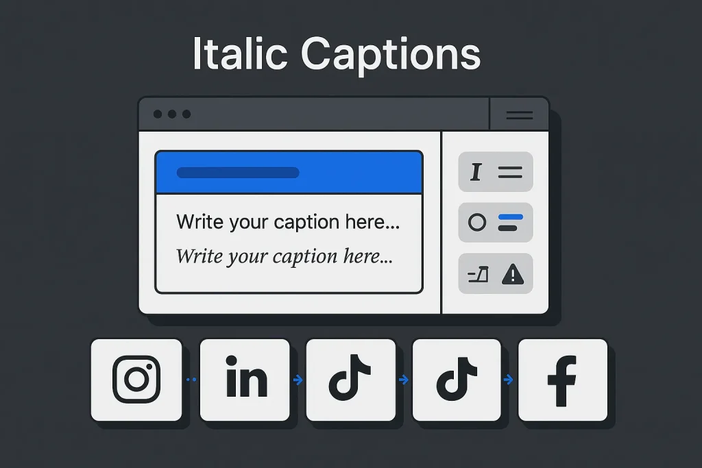
Social captions rarely fail because the idea is weak. They fail because formatting breaks between platforms, emphasis disappears in plain text, and the same post looks sharp on one app but clumsy on another. An italics generator fixes one specific problem well: it creates copy-ready Unicode characters that look italic, giving marketers and creators a fast way to add emphasis where native formatting simply does not exist.
That matters most in plain-text environments. Instagram captions, Facebook posts, X posts, TikTok bios, and many profile fields do not offer true rich-text italics the way a document editor does. So an italic text generator or italic font generator becomes a practical workaround: write normal text, convert it, copy it, and paste it into the target field. Simple workflow. Less simple reality.
Here is the key distinction: these tools do not apply formatting. They replace standard letters with Unicode lookalikes. The result is still plain text, just built from different code points. On our view, that is exactly why these tools are useful and why they are limited. You gain portability, but you also inherit trade-offs around readability, accessibility, search, compatibility, and content reuse.

For teams publishing at scale, this small formatting task turns into a repeatable friction point. One creator may only need a couple of faux italic words. An agency handling dozens of captions, campaign variants, and repurposed assets needs a workflow that cuts errors instead of multiplying them. We have seen this pattern often: tiny manual actions become expensive once volume goes up.
What an Italics Generator Actually Does (Unicode vs native italics)
An italics generator usually does not create true italics in the typographic sense. It converts standard characters into Unicode symbols that resemble italic letters. In practice, that means the output behaves like plain text you can paste into a caption, bio, comment, or username, not like formatted text inside a word processor.
The characters most generators use come from Unicode’s Mathematical Alphanumeric Symbols block. According to the Unicode chart for this block, those symbols sit in the range U+1D400 to U+1D7FF in Plane 1, also called the Supplementary Multilingual Plane. That matters because these are specialized code points, not styling instructions layered on top of normal letters.
Unicode’s own guidance is fairly cautious. The Unicode names list explicitly indicates that for general text, standard letters with markup are preferred over these styled symbols. The related Unicode technical report on mathematical characters makes the same point more broadly: these alphabets were designed mainly for mathematical notation, not for styling everyday prose on social media.
That is why an italicized font generator is best understood as a workaround, not a proper formatting system. It works because platforms accept the output as text. It breaks down because not every letter, accent, symbol, or punctuation mark has a perfect styled equivalent. Some characters stay unchanged. Some convert unevenly. Some render differently depending on the device font.
Older Unicode proposal material counted 115 characters in the italic style set and 115 in the bold italic style set. The exact number matters less than the broader point: these sets are finite. They are selective. They are not full replacements for every script or every use case. That is why a serif italic font generator or slanted text generator can handle standard Latin text reasonably well for short emphasis, but may struggle with multilingual strings or more complex punctuation.
The practical takeaway is simple: use Unicode italics as a visual cue, not as a substitute for semantic formatting. They work well for a short hook, a CTA phrase, a launch label, or a profile accent. They work poorly for long blocks of copy, accessibility-sensitive content, or posts that will be reused across multiple systems. On our view, that boundary is where most teams either look polished or start looking gimmicky.
A quick comparison makes the difference clearer.
| Aspect | Native italics | Unicode generator output |
|---|---|---|
| How it works | Applies formatting markup or editor styling | Replaces letters with Unicode lookalike characters |
| Best environment | Editors that support rich text | Plain-text social fields and profile inputs |
| Accessibility | Usually clearer and semantically cleaner | Can create inconsistent parsing or assistive behavior |
| Cross-platform risk | Low if supported natively | Moderate because rendering depends on fonts and app support |
For social captions, the Unicode route is useful precisely because plain-text fields are everywhere. It is not elegant. But it is often the only portable option.

Quick Steps: Generate, Copy, and Paste Italic Text
The workflow is straightforward, which is exactly why the copy and paste italics use case is so common.
- Write the plain-text phrase first. Keep it short. Examples: product launch, limited drop, new guide, save this, link in bio.
- Run it through an italics generator. The tool maps ordinary letters to Unicode lookalikes.
- Copy the output. This is where search behavior like italic font generator copy and paste, italic copy paste, and copy paste italic comes from.
- Paste into the target platform. Use the exact field where the caption or bio will publish.
- Preview before publishing. Test on mobile and desktop if the post has any commercial importance.
- Fallback if needed. If rendering looks broken, replace the faux italic phrase with plain text or move emphasis to line breaks and punctuation.
This process works because the output is still plain text from the platform’s perspective. No plugin, no editor extension, no native formatting support required. That makes an italic text converter practical for creators moving quickly across apps and channels.
There are still three checks worth doing every time:
- Character fidelity: confirm that letters, punctuation, and numbers stayed readable after conversion.
- Platform fit: make sure the converted string still fits the caption limit and line-break structure.
- Readability: shrink the styled segment if the result looks noisy.
Short styled phrases almost always beat long stylized paragraphs. A small cue like “new” or “save this” is usually enough. Converting a full 10-line caption into faux italics adds more risk than value. We would treat that as a red flag in any editorial review.
For teams building repeatable content, standardization helps. Keep a small bank of approved snippets rather than styling every caption from scratch. That keeps tone, legibility, and brand presentation tighter. It also makes an italic font copy paste workflow much easier to manage.
The step that deserves the most discipline is paste-testing. Unicode output can look fine inside the generator preview and then fail inside a specific app, font stack, or operating system. On practice, this is where most avoidable mistakes happen.
Where Italics Work Best: Instagram, Facebook, TikTok, X, LinkedIn
Platform behavior is uneven because most social feeds were not built around rich-text formatting. An italics generator for instagram or an instagram italic font generator is popular because users want emphasis in a system that does not offer native italic controls for standard captions. The same logic applies to an italic text generator facebook use case and, in many situations, to TikTok, X, and LinkedIn feed posts.
The safest assumption is this: Unicode italics are optional visual decoration layered onto otherwise functional plain text. If the styled characters fail, the caption should still make sense and still convert. We think that is the right mental model for any team publishing seriously.
LinkedIn is a good example of why field type matters. According to LinkedIn Help, regular posts have a 3,000-character limit. So any converted italic caption still needs to fit within the same cap. LinkedIn also differentiates standard posts from articles. Its documentation for LinkedIn articles indicates that articles support true formatting, including bold and italics. In other words, Unicode workarounds matter more for feed posts than for article publishing.
TikTok is a reminder not to guess. The current TikTok Help page for character limits is the right place to verify current rules, but the accessible snapshot available here did not expose the numeric limits directly. That is a practical lesson by itself: verify live platform documentation before finalizing any caption template.
X treats posts as plain text submissions, so faux italics fit the mechanics of the platform even if they are not native formatting. On Facebook and Instagram, the same approach usually works for short phrases, though rendering can vary by device and app version.
A channel-by-channel view helps teams decide where an italic font copy paste or copy and paste italic font workflow is worth using and where it is better avoided.
| Platform | Best use of Unicode italics | Primary risk | Recommendation |
|---|---|---|---|
| Short hooks, CTA words, profile accents | Long stylized captions reduce readability | Use selectively and preview on mobile | |
| Short emphasis in standard posts | Inconsistent rendering between app contexts | Keep the stylized portion brief | |
| TikTok | Bios or short caption accents | Current limit changes require verification | Paste-test and confirm live limit first |
| X | Single-word emphasis in plain-text posts | Character efficiency and visual clutter | Use one phrase at most |
| LinkedIn posts | Hook words in plain-text feed posts | Professional tone can suffer if overused | Use for restraint, not decoration |
The pattern is consistent across channels: the shorter the stylized phrase, the safer the result. We have rarely seen long faux-italic captions outperform clean structure and good line breaks.

The chart does not compare equivalent measures; it simply puts two operational realities side by side: field limits still apply, and the available styled alphabets are limited rather than universal.
Combining Styles: Bold + Italic, Underline, and Slanted Text
Users often search for a bold italic font generator, a bold and italic font generator, or a bold italic generator because a single style is not always strong enough in a crowded feed. This is where the distinction between formatting and substitution matters even more.
When a generator offers bold italic output, it usually is not applying bold and then italic to the same base text. It is pulling from a separate Unicode style alphabet that already contains bold-italic lookalike symbols. That is why the result can differ from what a word processor would produce with genuine typographic styling.
Underline tools are even less predictable. Some rely on combining characters layered under letters. Others use separate symbol tricks. Both approaches can create display issues, especially in tight UI spaces or when line height is constrained. A so-called slanted text generator usually refers to the same broad family of faux italic conversion, even if the label sounds more like marketing than technical precision.
There are three realistic use cases for combined styles in captions:
Hook emphasis. A launch word, date, or CTA can use bold italic to stand out at the beginning of a caption.
Profile decoration. Bios and profile labels can carry slightly more stylization than performance-oriented feed copy.
Template markers. Content teams may reserve one style for recurring units such as “New,” “Free,” or “Case Study.”
The risk rises fast when multiple styles appear in the same caption. Faux bold, faux italics, underline effects, emoji clusters, all caps, and broken line spacing create a low-trust pattern. That is especially damaging on LinkedIn and in B2B contexts, where clarity is the brand signal. On our view, this is one of the easiest ways to make otherwise good copy look amateur.
Use combined styles with a stricter threshold than single italics. In most cases, one stylized phrase per caption is enough. If the post already has strong structure through spacing, punctuation, and a clear opening line, more styling adds very little.
Caption Best Practices: Length, Hashtags, CTAs, and Line Breaks
Formatting should improve scannability, not compete with the message. That principle matters more than the generator itself.
The best captions using an italics generator usually follow four rules:
Keep the styled segment short. A few words are enough. Long italicized passages slow scanning and can look unstable in feed environments.
Separate emphasis from information density. If a caption already includes hashtags, links, tagged accounts, and a CTA, apply faux italics only to the opening hook or a single CTA phrase.
Use line breaks intentionally. In most social contexts, line breaks do more for readability than stylized text. Good spacing often replaces decorative formatting entirely.
Preserve plain-text meaning. If the Unicode styling disappears, the post should still read clearly and still guide the user toward the intended action.
LinkedIn offers a useful constraint model because its post limit is documented at 3,000 characters. Even where exact limits differ across platforms, the editorial discipline is the same: shorter, clearer, and structurally cleaner captions travel better. If the stylized output pushes a borderline caption into clutter, the styling should be the first thing removed.
A practical sequence for caption assembly looks like this: write the hook in plain text, define the CTA in plain text, place line breaks, insert hashtags last, then test whether a single italic phrase improves or harms the visual hierarchy. This order keeps the italic font converter or italic text converter from driving the structure.
For repurposed content, build the caption in layers. Base text first. Platform-specific edits second. Unicode styling last. That keeps the master copy reusable for email, blog excerpts, CMS fields, and paid social variants where special characters may be a bad fit.
These constraints look minor at the single-post level and become significant at scale. We have seen standardized caption frameworks save real editing time and reduce formatting drift across channels.

Readability and Accessibility: Contrast, Screen Readers, and Fallbacks
Unicode italics create a visual effect, but they do not automatically create better communication. Sometimes they do the opposite. Unicode guidance itself supports caution: styled mathematical letters are not the preferred representation for ordinary words when markup is available. That matters because accessibility and parsing systems may not treat these characters like standard prose.
There are three areas where risk shows up first.
Screen readers and assistive interpretation. Specialized Unicode code points may be handled differently depending on software, language settings, and device support. Even when they render visually, they may not be interpreted the same way as standard text.
Indexing and text processing. Because these characters remain distinct code points rather than automatically normalizing into plain letters, downstream systems may process them differently. That can affect search, moderation tools, exports, analytics pipelines, or internal parsing.
Human readability. Stylized text becomes harder to read when used in bulk. This is especially obvious in smaller mobile interfaces, dense B2B captions, or posts where the audience is scanning quickly.
The most reliable fallback is editorial, not technical: use Unicode italics only for emphasis that can be removed without changing meaning. If the phrase is central to comprehension, keep it plain. If the emphasis is aesthetic, keep it short. We consider that the safest rule in almost every business context.
One useful internal policy is to separate decorative text from critical text. Decorative text can be converted. Critical text should remain standard characters. That includes dates, links, product names, discount codes, deadlines, or compliance-sensitive language.
Another solid rule is to avoid faux italics in accessibility-first content formats, especially when posts target broad public communication or regulated industries. The visual gain is usually too small to justify the edge-case risk.
Interesting point here: many teams obsess over visual styling before they have solved baseline readability. In practice, clean structure, contrast, and message hierarchy usually outperform any italicized font generator trick.
The pattern is clear: short emphasis is usually acceptable, while long stylized passages create disproportionate readability risk.
Troubleshooting: Unsupported Characters, Sanitization, and Formatting Loss
Most failures with an italic text generator are predictable. They usually fall into four buckets.
Unsupported characters. Some accented letters, symbols, punctuation marks, or non-Latin characters may not convert cleanly because the generator depends on available Unicode equivalents.
Sanitization by platform or tool. Some scheduling tools, CMS bridges, browser extensions, or import workflows may alter or strip unusual code points.
Rendering differences. A post can look fine on one device and awkward on another because font support differs.
Formatting loss during reuse. When content is copied from a social document into email software, CRM tools, spreadsheets, or CMS fields, styled Unicode strings may no longer be desirable or may break process assumptions.
The best troubleshooting process is refreshingly simple.
First, reduce the styled segment to the minimum viable phrase. Second, test in the final publishing environment rather than in a draft note. Third, check both mobile and desktop if the channel matters commercially. Fourth, keep the original plain-text caption saved separately so fallback is immediate.
This is also where editors should separate generator failure from workflow failure. The generator may produce valid Unicode. The problem may come later, when a scheduler normalizes text differently, a spreadsheet export mangles the string, or a publishing assistant replaces characters during cleanup. On our view, most formatting issues blamed on the tool are actually process issues.
For teams using templates, it helps to build a small failure library: examples of characters that break, fields that strip formatting, and platforms where the output is inconsistent. Over time, that turns ad hoc testing into a documented publishing standard.
There is a useful analogy here with other conversion utilities. A format generator is only as reliable as the systems it passes through. That is one reason lightweight tools remain helpful but should not be confused with fully controlled formatting environments. The same operational lesson appears in adjacent workflows such as this APA format generator automation guide, where small text transformations become scalable only when the process around them is consistent.

Automation Tips: Shortcuts, Templates, and Consistent Formatting Across Channels
At small scale, an italic font converter is a convenience. At larger scale, formatting discipline matters more than the tool. Teams publishing across multiple social channels benefit from a workflow that standardizes when faux italics are used, which phrases are approved, and how final QA is handled.
The first level of automation is templating. Maintain a small repository of approved stylized phrases such as launch markers, CTA fragments, and recurring campaign labels. Store both the plain-text and converted versions. This makes copy paste italic, italic copy paste, and copy and paste italic font usage more consistent and reduces unnecessary variation.
The second level is workflow design. Build captions in plain text first, then route them through a final formatting layer for each platform. This is the same logic that makes structured content operations more resilient in SEO and editorial pipelines. Rather than decorating content at the drafting stage, apply presentation choices closer to publication.
The third level is publishing automation. If your content operation already relies on structured generation, semantic planning, and automated rendering, formatting becomes part of a broader production system. That is why teams exploring social workflow efficiency often end up looking beyond isolated utilities. A point solution handles one caption at a time. A full pipeline manages planning, drafting, formatting, QA, and publication as connected steps.
For example, if your content team is already evaluating how to scale structured workflows, the move from manual touchpoints to systemized output is similar to the shift explained in manual AI writing tools are obsolete. The real gain is not novelty. It is lower friction, less inconsistency, and faster execution.
That same principle is even clearer in SEO publishing environments, where formatting is only one piece of a larger content operation. The more mature model is a workflow that moves from planning to ready-to-publish output with fewer handoffs, as shown in this breakdown of an AI assistant for SEO content ops.
In practice, the best automation policy for social caption styling is conservative:
Standardize the phrases. Do not generate stylized text ad hoc for every post.
Limit the use cases. Reserve faux italics for hooks, CTA words, and profile accents.
Test the final environment. Scheduler previews are not enough.
Keep a plain-text source. Every stylized caption should have a normal-text fallback.
Document failures. Save examples of breakage by platform, field type, and device.
That is what turns a novelty formatting trick into a reliable editorial utility. We think this is the difference between a creator hack and an actual process.
Using SEO Autopilot in a Broader Formatting and Publishing Workflow
Formatting utilities solve isolated tasks. Content operations need systems. Teams that publish at scale across blogs, landing pages, and distribution channels benefit more from structured automation than from a growing stack of single-purpose tools.
SEO Autopilot fits that broader operational need. The platform is designed to automate SEO article production from semantic planning to content generation and WordPress publishing, reducing manual steps that typically slow down editorial execution. For teams that want a more consistent pipeline rather than fragmented tooling, the official SEO Autopilot site is the practical starting point.
The relevance here is not that SEO articles and social captions are identical. It is that both workflows improve when formatting, structure, and publishing logic are handled systematically. A small task like Unicode italic conversion highlights the same underlying truth: readability improves when presentation decisions are controlled, repeatable, and applied at the right step in the workflow.
На наш погляд, the real lesson is not about styling at all. It is about process discipline. A good italics generator can save time, but only if the surrounding workflow is clean, tested, and consistent.
Looking ahead, we expect platforms to keep favoring plain-text simplicity in core posting fields while creators keep searching for lightweight ways to stand out. That means tools like an italic font generator or italics generator will stay useful, but mostly as tactical utilities rather than strategic differentiators. The teams that win will not be the ones with the fanciest characters. They will be the ones with the clearest message, the strongest structure, and the fewest formatting surprises across channels.
FAQ
How do I make italic text for Instagram captions?
Use an italics generator to convert a short plain-text phrase into Unicode italic lookalikes, then copy and paste it into your Instagram caption. The safest move is to italicize only a hook or CTA phrase and preview it on mobile before publishing. If you are using an italics generator for instagram or an instagram italic font generator, keep the styled part brief.
Why don’t italics show up on some phones or apps?
Because most tools generate Unicode characters rather than true rich-text formatting. If a device, app version, or font stack does not support those code points well, the output may render inconsistently or fall back poorly. That is the downside of any italic text generator or italic font converter workflow.
Can I combine bold and italics in one caption?
Yes, but usually through a bold italic font generator that uses a separate Unicode symbol set. A bold and italic font generator or bold italic generator can work for one short phrase, but overdoing it quickly creates visual clutter and inconsistent rendering.
How to type in italics on phone keyboard?
Phone keyboards generally do not offer native italics for social captions. The usual method is to type normal text, run it through an italic font generator copy and paste tool, then paste the converted output into the app. In search, people also look for this as italic font copy paste or copy and paste italics.
Will Unicode italics affect accessibility or post reach?
They can affect accessibility and text processing because they are distinct Unicode characters, not standard letters with markup. That does not automatically mean reduced reach, but it does mean faux italics should be used sparingly, especially in longer captions or accessibility-sensitive communication. We would treat them as decorative, not essential.