
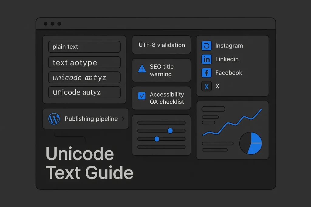
Decorative text can sharpen visual hierarchy in a crowded feed, but the moment a unicode text generator moves from playful styling into SEO-critical fields, the trade-off changes fast. Bloggers are not choosing a font in the traditional sense. They are often replacing ordinary Latin letters with different Unicode code points that only look similar on screen. That distinction affects search presentation, copy-paste reliability, accessibility, CMS behavior, and cross-platform rendering.
Used with discipline, Unicode styling can make short social captions, micro-CTAs, or section dividers more noticeable. Used carelessly, it creates broken characters, mixed glyph sets, unreadable titles, or metadata that platforms quietly rewrite. We see this mistake often: teams treat decorative output like harmless formatting, when in reality it changes the text object itself. The right approach is operational—know what the tool is producing, keep styled text in low-risk contexts, validate output in UTF-8 environments, and leave SEO-critical content in plain language where consistency matters most.
The technical base is stable. Unicode 16.0 added 5,185 characters in the 2024 release, and the broader Unicode specification now covers over 150,000 characters. But that does not mean every device, app, field, or browser will render every decorative variant equally well. Compatibility is the real constraint. Always has been.

What is a Unicode text generator and how it works
A unicode text generator is usually a converter, not a typeface engine. You enter standard text such as “New Product Launch,” and the tool maps those characters to alternative Unicode symbols that resemble bold, italic, script, monospace, circled, small caps, or decorative forms. The effect feels like font styling, but the underlying characters are different code points.
This matters because normal font formatting in HTML uses CSS to style the same underlying letters. A font unicode generator or unicode generator usually changes the characters themselves. In practice, that means your copied result may look correct on one platform, partly correct on another, and broken on a third if a glyph is missing or normalized differently.
For bloggers, the workflow is simple:
- Plain text is entered into a unicode text generator online.
- The tool transforms letters into visually similar Unicode symbols.
- You copy and paste the output into a CMS, social post, bio field, CTA, or headline.
- The receiving platform decides how well those code points render.
Many outputs come from compatibility ranges or mathematical symbol blocks rather than from everyday alphabetic text. Unicode supports several normalization forms—NFD, NFC, NFKD, and NFKC—to help systems process equivalent text consistently. For stylized output, normalization can become a hidden source of change: one application may preserve a decorative sequence, another may simplify or reinterpret it.
On the web, encoding discipline is non-negotiable. The W3C recommends UTF-8 for storage and transmission, and MDN guidance on character encoding notes that <meta charset="utf-8"> should be used so Unicode characters display reliably. A unicode text generator website can produce perfectly valid output, yet your page can still display it incorrectly if the document or export layer is mishandled.
The main lesson is procedural: conversion is easy; stable rendering is the hard part. On our view, this is where most tool pages oversimplify the story.
Why bloggers confuse Unicode styling with fonts
The term unicode fancy text encourages the wrong mental model. In design systems, a font changes appearance while preserving text identity. In Unicode conversion tools, identity often changes with appearance. That is why search engines, assistive tools, validation layers, and text parsers may not treat decorative output exactly like ordinary body text.
This is also why a unicode characters generator is better understood as a symbol mapper. We consider that the safer framing. If you treat the result as display text for selective emphasis—not as a full replacement for standard writing across a site—you avoid most of the damage.
When to use Unicode styles in blogging and social posts
A unicode text generator copy and paste workflow is most useful when the text is short, decorative, and non-essential to machine interpretation. That includes social post hooks, lightweight CTA emphasis, list separators, giveaway announcements, story slides, profile section accents outside restricted fields, and occasional blog subheading experiments when readability stays intact.
Good use cases usually share three traits. The text is brief. The styling is optional to comprehension. And the content is not the main SEO title, URL slug, canonical label, schema field, or critical navigation element.
Bloggers can use stylized Unicode in places like:
- Social captions where one short phrase needs emphasis.
- Inline promo labels such as “New,” “Update,” or “Bonus” in newsletters or embeds.
- Visual separators in community posts.
- Image overlays and graphics, where the final asset is flattened visually rather than parsed as live text.
Where it becomes risky is predictable: article titles, title tags, category names, author names, core menu items, and evergreen body copy that must remain readable across devices and accessible technologies. If you are using a unicode name generator for a public identity field, platform policy may block or restrict that choice. LinkedIn is a clear example; LinkedIn Help states that profile names cannot include special characters that do not reflect a real or preferred professional name.
For bloggers operating across site, email, and social, the practical rule is narrower than many tool pages suggest: Unicode styling works best as campaign decoration, not as content infrastructure. We think that distinction saves a lot of cleanup later.
Low-risk placement examples
Short social prompts such as “New guide,” “Template drop,” or “Weekly picks” can tolerate a decorative treatment because the surrounding plain text still carries meaning. A CTA badge in a landing page hero can also work if the main headline, metadata, and body copy remain standard. A unicode bold text generator can be useful here for visual contrast when CSS access is limited, such as in some social platforms.
High-risk placement examples
A main blog headline generated via unicode creator logic is a poor default. Search engines may reinterpret it, screen readers may read it inconsistently, and users copying the title into chat, notes, or internal tools may get unexpected characters. The same caution applies to a unicode text generator for linkedin when the target field is a profile name instead of a post body.
For creative adjacent assets, visual text tools can be more appropriate than character substitution. If the goal is display treatment inside a graphic rather than live text inside metadata or HTML, a design-oriented workflow may be better. For example, a 3D text generator for header graphics belongs in a graphic workflow, not in your title tag logic.
Benefits and risks: readability, accessibility, and SEO
Unicode styling has one obvious advantage: attention management. In crowded interfaces, a short stylized phrase can interrupt scanning patterns. That helps with captions, launch notes, and lightweight promotions. The problem is that visual novelty often clashes with text reliability.
The benefits are real but narrow:
- Higher visual contrast in short-form social content.
- Fast differentiation without access to rich text controls.
- Simple copy-paste workflow for non-design teams.
- Useful experimentation in campaign assets and microcopy.
The risks are broader:
- Reduced readability in long strings.
- Inconsistent rendering across devices or apps.
- Accessibility issues for assistive technologies.
- Search display instability in SEO-critical titles.
- Normalization or sanitization during import/export.
- Mixed-script appearance that weakens brand professionalism.
SEO is where discipline matters most. Google Search Central recommends concise, descriptive page titles, and Google’s title link documentation explains that title links may be replaced when a provided title does not align well with content or writing system expectations. Over-stylized Unicode in title tags can reduce control over how the result appears in search. On our experience, that is a bad trade for any business page that depends on predictable organic CTR.
| Placement | Business value | Risk level | Recommendation |
|---|---|---|---|
| Social caption hook | Moderate | Low to medium | Use sparingly in short phrases |
| Blog H2 or callout label | Moderate | Medium | Test before publishing |
| Title tag / SEO title | High if stable | High | Avoid decorative Unicode |
| Author or profile name | Low | High | Avoid on regulated platforms |
| Graphic overlay or image text | High for branding | Low | Often better than live Unicode text |
The safest interpretation is straightforward: Unicode styling is a presentation tactic, not a core SEO tactic.
These scores are editorial guidance rather than external benchmark data, but they reflect how operational risk rises as text gets closer to identity and search-critical fields. We would be even stricter for SaaS, finance, and B2B brands.

Popular Unicode styles explained (bold, italic, script, symbols)
Not all styles behave the same way. Some are relatively legible and conservative. Others create friction almost immediately. Bloggers should think in terms of operational tolerance, not novelty.
Bold and pseudo-bold styles
A unicode bold text generator is one of the most common tools because bold-like forms can create emphasis in platforms that do not offer native formatting. These are usually more readable than elaborate script styles, especially in short labels. Even so, they should not replace plain text in large content blocks.
Italic and slanted styles
Italic-like Unicode forms can help a caption or CTA stand apart. They are often suitable for short feed copy where visual contrast matters more than machine parsing. If social visibility is the goal, a related tactic is covered in this guide to an italicized text generator for social feeds. The same caveat applies: keep the styling short and keep the surrounding message plain.
Script and cursive styles
These are visually distinctive but usually less readable. On some devices, script forms are rendered beautifully; on others, they feel uneven or fragile. On our view, script is a weak default for professional B2B communication, especially in LinkedIn-adjacent content where clarity and credibility matter more than ornament.
Monospace, small caps, and enclosed characters
Monospace-like outputs can work for code-adjacent or technical brands. Small-caps-style conversions and circled characters are useful for labels or list markers, but they can quickly look noisy if overused. Reserve them for isolated UI-like phrases.
Symbols and decorative separators
Unicode text symbols are often more reliable than full decorative alphabets because they supplement plain text rather than replace it. A star, arrow, check, divider, or bullet can provide enough emphasis without introducing a complete alternate character set. In many cases, a simple symbol strategy is more robust than a full unicode art generator style treatment.
One editorial rule we keep coming back to is simple: if the effect can be achieved with one or two symbols around plain text, do that instead of converting the entire phrase.
Platform specifics: Instagram, LinkedIn, Facebook, and X/Twitter
Platform behavior is the deciding factor for most marketers. A unicode text generator for instagram may perform acceptably in captions or bios, while the same string copied into a professional identity field elsewhere may fail policy or look inconsistent.
Instagram is one of the friendliest environments for short decorative Unicode. Captions, profile bios, and story-related text can often tolerate stylized output, particularly when the phrase is short. The main risks are readability and device variation. Overuse also makes a profile look templated rather than branded.
A unicode text generator for linkedin should be used cautiously. In posts, selective emphasis may render correctly. In profile names and highly professional fields, it is risky from both policy and brand-positioning perspectives. LinkedIn’s restrictions on special characters in names make this especially important. For B2B bloggers, Unicode on LinkedIn should be conservative and mostly limited to post body micro-emphasis, if used at all.
A unicode text generator for facebook, facebook unicode generator, or unicode text converter facebook workflow still works for many page posts and profile descriptions, but rendering can vary by app version, device, and user environment. Facebook content also gets copied, shared, and reposted into many other contexts, which increases the chance of garbling or mixed presentation.
X / Twitter
Unicode styling can stand out in short text formats, but the same compression of space means legibility matters more. If a decorative headline forces users to slow down, the visual advantage can cancel itself out. Fast-moving platforms reward quick comprehension.
Across all platforms, the best-performing model is the same: keep the main semantic message in plain text, then add a small Unicode accent where appropriate. We have seen this outperform heavier styling again and again.
| Platform | Good use case | Avoid using it in | Practical note |
|---|---|---|---|
| Short caption hooks and bio accents | Long captions in decorative script | Keep phrases short | |
| Occasional post emphasis | Profile names and formal identity fields | Professional tone overrides novelty | |
| Page post highlights | Cross-posted evergreen body copy | Expect mixed rendering across surfaces | |
| X / Twitter | Short launch lines or CTA fragments | Dense text with multiple decorative styles | Speed of reading is critical |
The platform decision is rarely about what is technically possible. It is about what remains clear, compliant, and brand-safe after publishing.

Step-by-step workflow: generate, QA, and copy without breaking text
A reliable workflow prevents most Unicode problems. Bloggers who publish occasionally can do this manually. Teams publishing at scale should formalize it in a content checklist.
1. Start in plain text
Write the original phrase in standard characters first. This gives you a clean fallback version for metadata, alt text, internal references, redirects, and future reuse.
2. Choose one style only
Do not mix script, bold, enclosed, and symbol-heavy variants in one line. A good unicode text generator website may offer dozens of options, but in practice the best choice is usually the most conservative one that still creates contrast.
3. Paste into a scratch environment
Use a plain text editor, CMS draft, or staging field to check whether the output remains stable. If characters change on paste, you have an immediate warning that downstream systems may also alter them.
4. Confirm UTF-8 handling
HTML5 environments should declare UTF-8 correctly. MDN notes that the charset declaration must appear within the first 1024 bytes of the document, which matters when copied fragments behave strangely after template changes or export layers. If a blog theme or custom output strips or misplaces encoding declarations, even valid Unicode can display poorly.
5. Test on desktop and mobile
Check at least one desktop browser and one mobile device. If the content is intended for a social platform, preview it inside the app rather than assuming browser behavior will match app behavior.
6. Keep SEO fields plain
Use standard text for page title, meta title, slug, navigation, and schema-facing labels. This is where search clarity matters most.
7. Save a plain-text backup
If a future redesign, export, feed integration, or CMS migration breaks the stylized text, you can restore the message quickly.
Content teams that already structure ideation and production systematically can fold Unicode QA into a broader editorial workflow. If your publishing process starts much earlier at topic planning, a useful companion process is this random themes generator for blog ideas approach that preserves SEO focus before formatting decisions enter the workflow.
Testing across devices and browsers to avoid tofu and missing glyphs
“Tofu” is the common term for empty boxes that appear when a device cannot render a character. Missing glyphs are not a sign that Unicode failed globally. They usually mean the receiving environment lacks support for a specific character, style range, or font fallback path.
The most common causes are:
- Unsupported glyphs on older devices or app versions.
- Normalization changes after copy-paste.
- Encoding issues during import or export.
- Platform sanitization of certain characters.
- Mixed-style strings assembled from different generators.
Modern browsers generally handle actual Unicode symbols directly when a page is encoded correctly in UTF-8. Problems tend to increase when text moves across systems: spreadsheet to CMS, generator to social app, note-taking app to browser field, or API to WordPress editor. Stability depends less on the generator itself than on the entire chain. That is the part many teams underestimate.
These shares are editorial workflow estimates, not external benchmark data, but they mirror the most frequent failure points teams encounter in real publishing chains.
What to test before publishing
Check the live field, not just the generator output. Confirm that the same string renders inside the CMS editor, the front end, the social composer, and the final published view. Also verify that copying the published text back out does not introduce corruption.
If you manage high-volume output, define a small approved style library instead of letting every writer use any unicode characters generator result they find online. Standardization reduces rendering drift. On our view, this is one of the easiest process wins for content teams.
At scale: automate WordPress publishing and style choices (soft-sell Autopilot SEO)
Unicode styling becomes operationally expensive when content teams publish frequently. The issue is not generating a stylized line once. The issue is governing where it may appear, preserving plain-text fallbacks, keeping SEO fields clean, and preventing editors from pasting decorative text into title tags, slugs, or core page elements.
This is where workflow automation matters more than the generator itself. Teams need a repeatable pipeline that separates creative display text from SEO infrastructure: keyword planning, content structure, body copy generation, metadata discipline, internal linking, media handling, and WordPress publishing.
For that reason, the better soft-sell angle is not “automate Unicode styling everywhere.” It is “automate the parts that should be standardized, and keep decorative text under control.” Platforms such as SEO Autopilot are useful in this context because they help teams scale content operations from semantic planning to WordPress publication while maintaining structured rules around titles, content sections, and publishing workflows. That reduces the chance that visual experiments leak into SEO-critical fields.
In practice, a structured content system can enforce plain-text defaults for titles and metadata, preserve editorial templates, and still leave room for campaign-specific styling in low-risk blocks such as social snippets or optional callouts. For agencies and multi-site teams, that governance is more valuable than any standalone unicode text converter facebook, font unicodepad generator, or decorative utility.
If the broader goal is scaling a repeatable publishing engine, not just formatting a caption, this guide to building content machines for SEO agencies complements the same operational mindset.
Tool selection checklist: features, privacy, and reliability
Most Unicode converter tools look similar, but they differ in safety and practical usefulness. A weak tool offers many styles and no governance. A better tool helps you make selective, testable choices.
Evaluate a unicode text generator online, unicode generator, or even a niche unicode creator against the following criteria:
- Clear preview of plain text versus converted text.
- Simple copy flow without hidden characters or injected formatting.
- Conservative styles that remain readable.
- No requirement to log in for basic conversion.
- No intrusive scripts or suspicious permissions.
- Reliable rendering in common desktop and mobile environments.
- Ability to reverse or recover plain text when needed.
Privacy is often overlooked. If a generator stores inputs or embeds aggressive advertising scripts, it may be a poor fit for brands handling unreleased campaign copy, client names, or confidential messaging. For enterprise or agency contexts, even a trivial formatting tool belongs inside a security-aware workflow. We think this matters more than most roundup articles admit.
| Selection factor | What to look for | Warning sign |
|---|---|---|
| Output quality | Readable styles, stable copy-paste | Broken or mixed glyphs |
| Transparency | Explains that styles are Unicode characters, not fonts | Overpromises on compatibility |
| Privacy | Minimal tracking, no unnecessary input collection | Aggressive ads or data capture |
| Workflow fit | Easy fallback to plain text | No reversible baseline |
The best tool is usually the one that encourages restraint, not the one with the most ornate outputs.
Troubleshooting common issues (boxes, mixed fonts, paste errors)
Most Unicode problems fall into repeatable categories. Once you identify the category, the fix is usually straightforward.
Boxes or empty squares
This typically means the target environment lacks the glyph. Replace the style with a simpler one, shorten the phrase, or fall back to plain text. If the content is on your website, confirm UTF-8 handling and test another browser or device.
Mixed fonts or uneven look
This happens when different characters in the string come from different Unicode ranges or fallback fonts. Use one generator output only and avoid manually combining styles. A unicorn font generator-style novelty output may look fun in a tool preview but unstable in production.
Text changes after paste
The receiving app may normalize or sanitize characters. Paste first into a plain-text scratch pad, then into the destination. If it still changes, use a different style or keep the content plain.
Looks fine on desktop, broken on mobile
Mobile apps often rely on different rendering stacks. Always preview in the actual app if mobile is the primary destination.
SEO title looks wrong in search
Remove decorative Unicode from the title tag and social title fields. Keep a standard meta title and, where relevant, a standard og:title. Google has clarified that title link generation may use multiple sources, including Open Graph title signals in some cases, so consistency matters.
CMS export or import corruption
Confirm that the entire chain—editor, database, export, import, API, and rendered theme—preserves UTF-8 correctly. Unicode itself is stable by design, but implementation details still decide whether the result survives intact.
Examples and templates for blog headers, CTAs, and social captions
The most effective templates keep the decorative portion short and preserve plain text around it. That gives you the visual bump without sacrificing clarity.
Blog header label examples
Plain-text first: New Guide: Unicode Best Practices
Light Unicode accent: ✦ New Guide: Unicode Best Practices
Selective emphasis: 𝐍𝐞𝐰 Guide: Unicode Best Practices
CTA examples
Safe: Download the checklist →
Safer decorative variant: ✧ Download the checklist →
Riskier variant: 𝐃𝐨𝐰𝐧𝐥𝐨𝐚𝐝 𝐭𝐡𝐞 𝐜𝐡𝐞𝐜𝐤𝐥𝐢𝐬𝐭 →
Instagram caption hook templates
Template 1: ✦ New post: [topic]. Plain-English summary follows.
Template 2: 𝐍𝐞𝐰 𝐫𝐞𝐬𝐨𝐮𝐫𝐜𝐞: [topic]. Full breakdown in bio.
Template 3: → [benefit] for [audience]. One line of Unicode emphasis only.
LinkedIn-safe post opener templates
Template 1: Update: [topic]. Key takeaway in one sentence.
Template 2: ✦ New analysis: [topic]. Three operational lessons below.
Template 3: [Plain text headline]. Optional Unicode symbol only, no stylized full title.
In most B2B contexts, symbols outperform full decorative alphabets because they add contrast without compromising credibility. If you need more visibility in feeds, design and content structure usually create better long-term results than heavy character substitution. That is our position, and in practice it is the one that scales cleanly.
We believe the real takeaway is simple: a unicode text generator works best as a precision tool, not a default writing system. Short accents in low-risk placements can improve scannability, but decorative Unicode becomes expensive the moment it touches titles, identity fields, accessibility-sensitive copy, or anything tied to SEO infrastructure. The teams that get value from it are usually the ones with rules, QA, and plain-text fallbacks already in place.
Our forecast is pragmatic. Platforms will keep supporting a wide range of Unicode characters, but content systems, search surfaces, and professional networks will keep favoring clarity over ornament. We expect controlled use of unicode fancy text and unicode text symbols to remain useful in social microcopy, while heavier decorative patterns will keep losing ground in serious publishing workflows.
FAQ
Is fancy Unicode text bad for SEO?
Not always, but it is risky in SEO-critical fields. On our view, fancy Unicode should stay out of title tags, meta titles, slugs, navigation labels, and structured content that search engines or platforms may reinterpret.
Why doesn’t my bold Unicode text show on some devices?
The device or app may not support the exact glyphs used by the converter. Many outputs from a unicode text generator are alternate Unicode code points, not true font styling, so rendering depends on platform support.
How do I make Unicode text for Instagram and LinkedIn?
Start with plain text, convert one short phrase, then test it in the actual platform before publishing. For Instagram, short stylized hooks usually work better than long decorative lines; for LinkedIn, keep usage conservative and avoid profile-name fields.
Is it safe to use a Unicode text generator for brand content?
Yes, if it is limited to short, non-essential display text and validated before publishing. It is not a safe default for titles, metadata, accessibility-sensitive copy, or professional identity fields.
How can I convert Unicode fancy text back to plain text?
The safest method is to keep the original plain-text version before conversion. If that is not available, use a reverse converter or manually replace stylized characters with standard Latin letters, then verify the result in a plain-text editor.